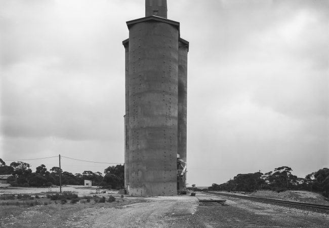
Silo, Carina, Mallee Highway, Victoria. Ink Jet Print This picture of a…
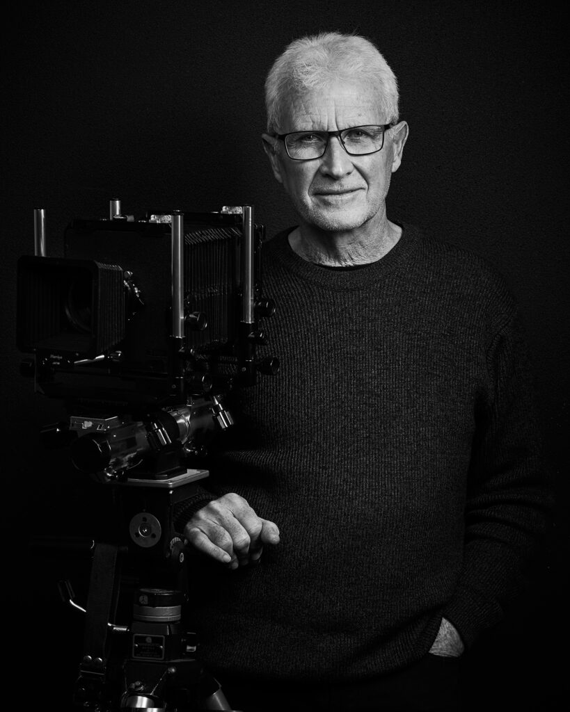
Folio: Greg Wayn
The last time I processed large format negatives in my darkroom was 1998, such a long time ago. While I have a great deal of nostalgia for the darkroom, things have moved on for me. All my recent work has been based on either digital capture and print or the production of digital pigment prints made from scans of my negatives.
Analogue processes still remain a wonderful and at times magical thing to me and it does my heart good to see people still currently fully engaged with these processes. There is something special in the ‘slowness’, connections and disciplines of analogue processing. May it long continue.
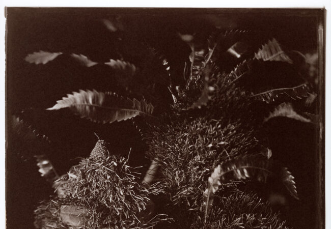
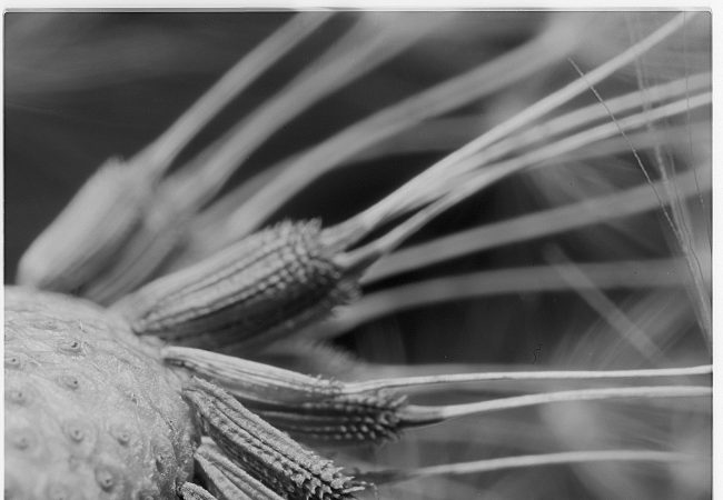
For the folio presented here, I have concentrated on images made from 4 x 5 negatives, as this had been the most used format for me. I have also made a smaller bodies of work based on 8 x10 negatives, and a larger body of work based on the 6 x 6 cm format.
Examples of these can be seen on my website.
I have chosen twelve images that represent the various aesthetic directions I was exploring at the time and I hope the viewer will be able to get a sense of these.
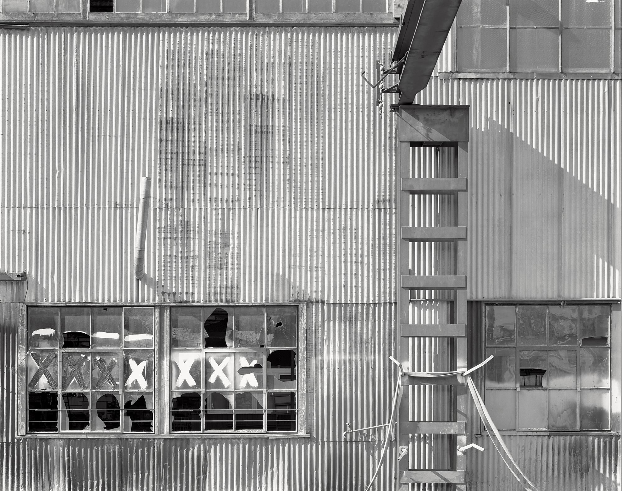
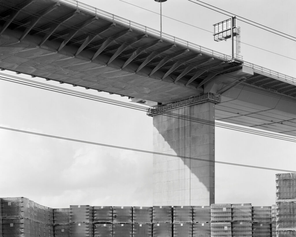
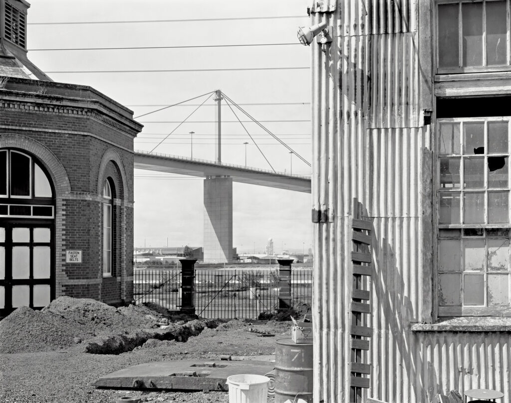
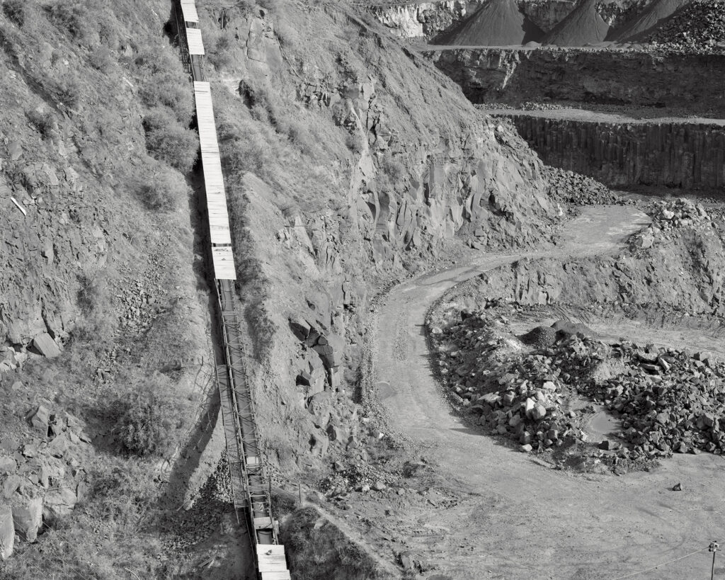
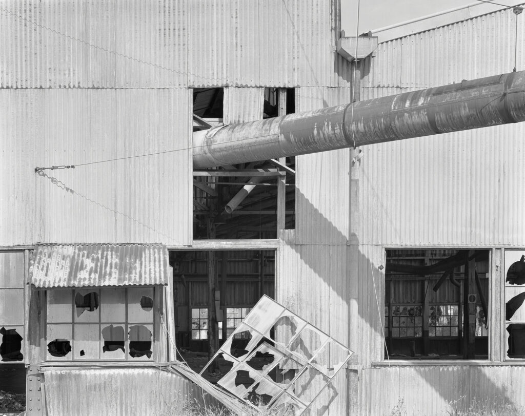
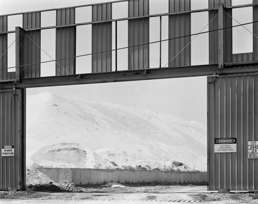
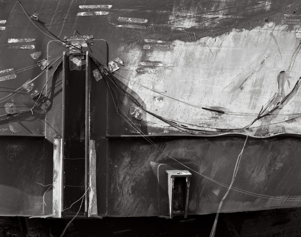
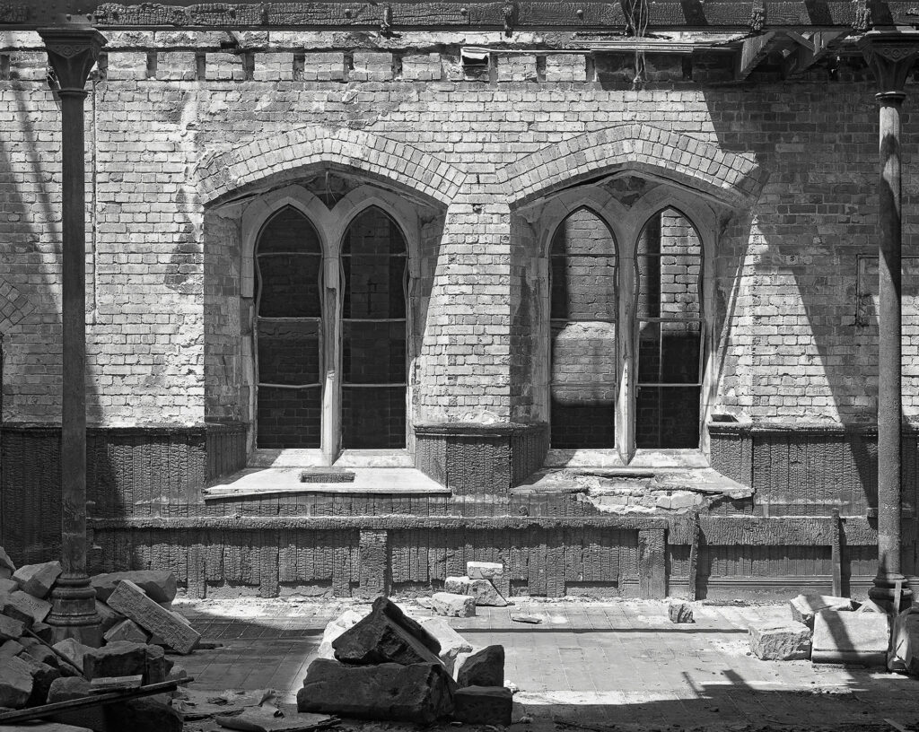
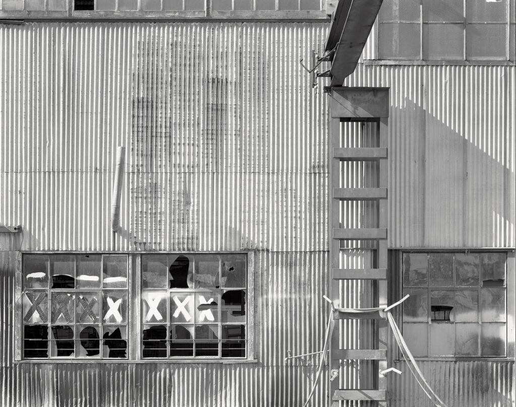
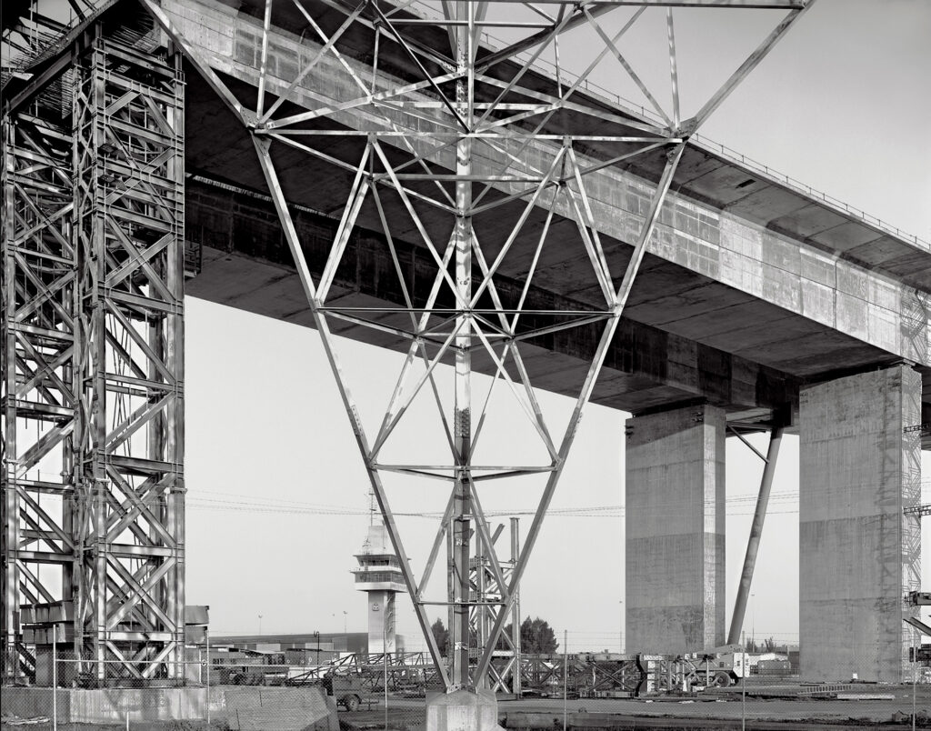
In the main, my large format work has concentrated on areas I define as Industrials and Abstracts.
My landscapes were predominantly made using the 6×6 format.
While much of my work at this time focused on industrial sites that may seem a rather bleak subject matter to some, at the right time I found them visually rich and full of possibilities. I have long been drawn to industrial areas and have been an avid collector of industrial detritus, rusty metal and other patinated ‘rubbish’ that has formed the basis of other aspects of my photography.
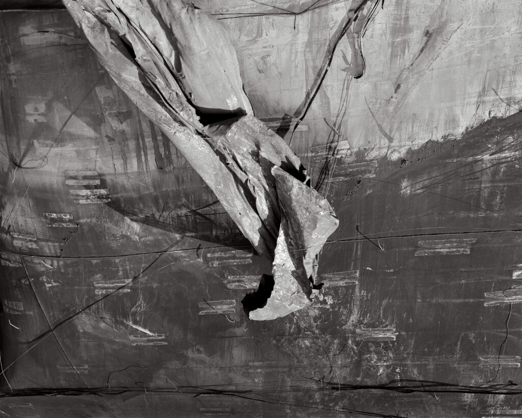
There is a dichotomy between the intimidating, noisy, destructive and environmentally dangerous aspects of many of these places, and the formal sculptural qualities, design elements and the interplay of light and scale. Even the destroyed and toxic tanks from the Coode Island disaster had formal and beautiful aspects for me and were especially poignant to ponder.
My images are highly structured and I have always taken great delight in complex spatial juxtapositions and deliberate ambiguity where forms intersect.
The use of a view camera was an essential part of these process as it allowed for very fine control over these elements. Perspective correction ability was critical and a general belief that no part of the composition should be more or less important than another, that the edges were just as important as the centre and other graphic considerations were clearly on my mind. The clarity and resolution of a large format camera was an intrinsic requirement for my industrial series and while the darkroom prints (usually 11 x 14) have both intensity and delicacy, they also come alive at mural size proportions, revealing the full power of large format film.
I often think of a photograph in terms of a two dimensional ‘drawing’. As a photography and visual arts teacher, I had always used principles of drawing as my focus in photography. The conversion of three dimensional spaces to a two dimensional image on a flat plane is a significant process to contemplate.
The use of a ‘longer than standard’ lens in the bulk of my industrial work enhances the sense of a more compressed, intense space and again has informed my photographic practice in this aspect.
As far as the conceptual side of this work, you may deduce that it is essentially a modernist approach and I would be relatively happy with that description.
All negatives were processed in my (small but efficient) darkroom, which now remains unused, but not yet abandoned.
The majority of my darkroom prints were either 8 x 10 , 11 x 14 and occasionally 16 x 20.
I used a range of print refinement processes such as print bleaching, tonal remapping and print toning.
For other versions and exhibition purposes, scanned negatives were used to make mural size images realised as either Type C (Chromogenic) or digital pigment prints on archival rag papers.
My last exhibition of purely analogue silver gelatin prints, titled In Industrial Light, was held at The Photographers’ Gallery in 1993.
The last 4×5 negatives I processed in 1998, formed the basis of an exhibition called ‘Vertigo’, held at the Lab X Gallery, where the prints were all mural size Type C prints from scanned negatives.
Rather than repeat myself, if anyone is interested in a more detailed explanation of my materials, processes and influences, please refer to my post in the The Photograph Considered section on this site or on my website.
Best wishes to all practitioners of analogue photography.


I have developed a series of Photoshop Actions to mimic the physical toning on the darkroom prints (using samples taken directly from the print itself) and have used these for this folio of images.
The majority of my prints were made on Ilford Gallerie and usually toned in Selenium (to intensify the blacks and for archival purposes) in combination with tea or dilute Poly Toner to warm the highlights.
The two prints of the remains of some of the large tanks that exploded in the Coode Island disaster were printed on Record Rapid and ‘split toned’ in Selenium (producing the ‘reddish’ colouration in the shadows typical of this process) and tea or Poly Toner to warm the highlights.
Greg Wayn Photographs a book of Industrials, Abstracts and Landscapes.. can be seen here.
Greg’s photographs can also be seen on his Instagram.
Next Post: So What is Dye Transfer? by Andy Cross
Previous Post: Mat Hughes wins curators prize

Greg, a superb set of industrial photographs. Thank you for being part of the Folio series.
Greg, this is a superb portfolio of both industrial Melbourne and industrial abstracts. I am in awe of what you achieved with this body of work. It is an eye opener. I had a look at your Industrial Blurb book —- it sure looks great, but dam, it is expensive.
I find it interesting that the curators of Australian photography and photo historians say that there no tradition of abstract photography in Australia but there is some excellent abstracts right there.
Wonderful works Greg
Some complex and beautifully balanced compositions of tones and shapes Greg.
All of these images are memorable and quite nostalgic for me as I was there when most of these were taken.
Greg always astounds me with his sharp eye for strong composition whilst often injecting a splash of both tension and humour.
Greg, its simply amazing to see your folio of superb black-and-white images. Not only are they interesting, but they are unique in their own way. Well done!