View Camera Australia is proud to present Online Exhibition number twelve. Featuring the work of: Patrick Macalister, Greg Wayn, Kate Baker, Janet Naismith, Tom Sheppard, Zhan Teh, Alex Bond, John Gitsham, Wendy Currie, Greg Soltys, Charles Millen, Murray White, C Brian Smith, Stuart Clook, Bruce Herbert, Bianca Conwell, Mark Darragh, Keiko Goto, Andy Cross, Peter McDonald, Justin Reeders, Peter Kinchington, Mick Lord, Keira Hudson, Shane Booth, Mat Hughes, Gary Sauer-Thompson, James Pierce, Bruno Kongawoin, Gary Chapman, Peter de Graaff, Ian Raabe and Ray Goulter.
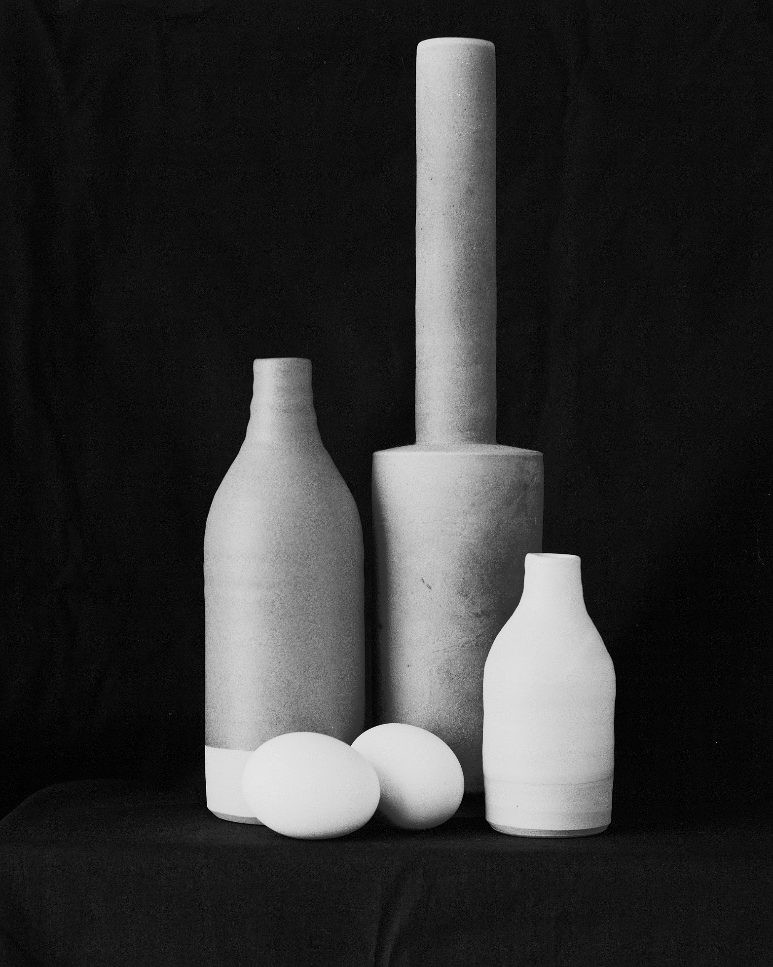
Photograph above: Still Life #1. Scan of 4 x 5 negative. Patrick Macalister.Website.
Greg Wayn
Burnt out church. Powlett Street. 30 x 38.5 cm inkjet print from 8 x 10 negative. Website. Instagram.
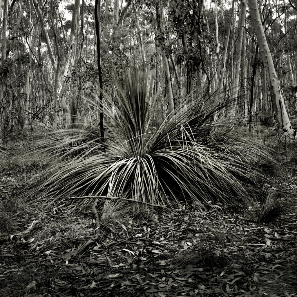
Kate Baker
Kurrunganner Reverie. 25 x 20 cm silver gelatin print from paper negative from scanned 4 x 5 film negative. Instagram.
Janet Naismith
High Country Retreat. 20 x 20 cm hand painted with water based oil on textured silver gelatin paper.
Tom Sheppard
Industrial. Scan of 6 x 4.5 cm negative. The Junee Railway Museum is a goldmine for black and white image making. While I am more of a landscape photographer, I couldn’t resist a chance to spend time here with my camera. Website. Facebook.
Zhan Teh
West Lake Chinese Restaurant. Scan of 4 x 5 negative. Website. Instagram.
Alex Bond
Scan of 6 x 6 cm negative. A rare display of early morning mist in what has been an unusually dry 7-month period with little to no rainfall, Flooded Gum, Canning River wetlands, Perth. Website. Facebook. Instagram.
Melting Moments 25 x 20 cm silver gelatin print from 4 x 5 negative I visited Johanna Beach in the Great Otway National Park, and outside of the school holiday period was able to enjoy the location with few other visitors around. With low tide and diffused sunlight, I made several images over the morning. This capture reveals the sand residue and drying water marks inflicted from the fury of earlier wave action. Website.
C Brian Smith
Maraetotara. 12.5 x 10 cm carbon print from 4 x 5 negative.
Stuart Clook
Armeria maritima. 20 x 20 cm carbon print, digital internegative separations from original 6 x 6cm trichrome film negatives. Website.
Brown algae. Yallock-Bulluk Marine and Coastal Park. Scan of 4 x 5 transparency. Website. Instagram.
Keiko Goto
Multifaceted One. 10 x 14.5 cm collotype from 8 x 10 negative. Website. Facebook.
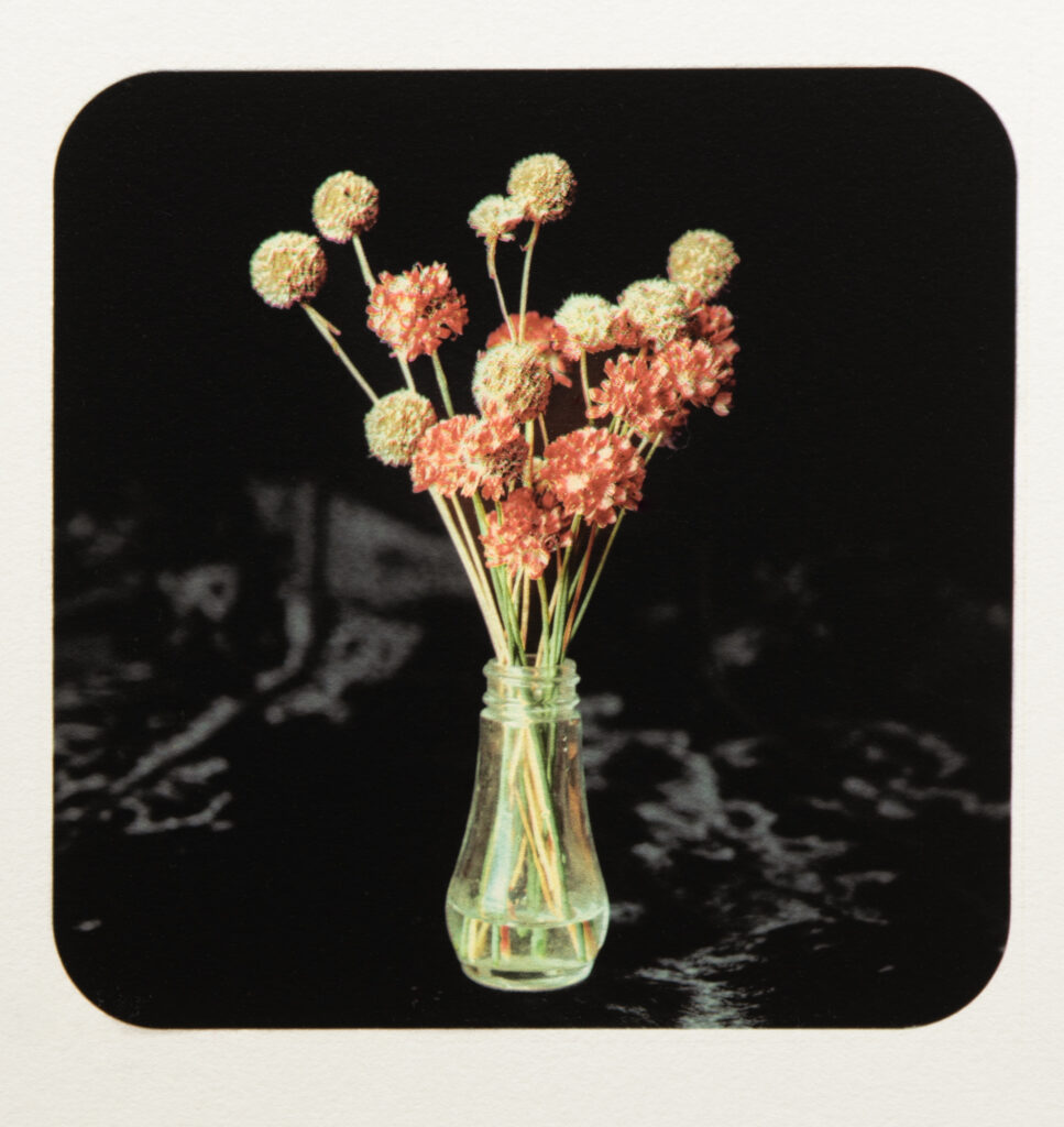
Andy Cross
This is a proposed dye transfer image. The window and sink was shot last November at the Trentham Gathering. If I had the flowers with me I would have created this still life. The flowers were shot as a separate image and stripped in with photoshop. The dye transfer hasn’t been made yet but will be by the time this is posted. Original B&W image shot on 4×5 Tri-X. Flowers shot on 4×5 Ektachrome. New colour transparency made on 4×5 Ektachrome.
Peter McDonald
Wetlands. VanDyke brown contact print from cropped 8 x 10 negative.
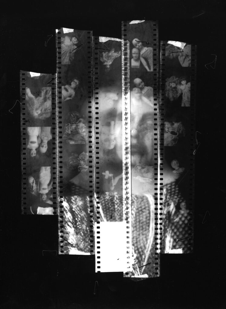
Justin Reeders
Gowrie Plains – Tamworth. Scan of 4 x 5 transparency. Facebook. Instagram.
Devil on my Shoulder from the Jigsaw series. 25 x 20 cm silver gelatin contact print. Seven days after my partner of seven years moves out, I photograph all the strange dolls in the house. Some posed with a cross, some with a noose. I staple the film into an 8×10 holder. Everything is in the dark, so the film strips are wonky and scratched from fumbling fingers. I hold my breath as I pose, but the softness creeps in as I move through the long exposure. During printing I find the truth of the image – a devil whispering in my ear, as I try to stitch myself back together in front of frozen eyes. Website.Instagram.
Shane Booth
Aftermath. 10 x 10 cm silver gelatin print from 120 roll film. Instagram. Facebook.
Mat Hughes
Kerferd Road Pier. Two layer gum bichromate over cyanotype. 30 x 38 cm. Digital negative from 4 x 5 pinhole camera film negative. This photograph is one of a number I have been making recently. They all start with a quick lens sketch made to film using a pinhole camera and outline the broad elements of a composition. Inspiration in part comes from Whistler’s Nocturnes hence dusk, water, and pinpoints of light. I find that years of conditioning hold me back from pursuing some of Whistlers more abstract qualities, it’s a continual fight. Gum layers are developed and manipulated by brush with a fast cavalier attitude to add texture and detailing. I’m only really interested in the essence of a scene and try to avoid revealing too much detail so work fast. The final layer is thick with dense lamp black pigment. Previous layers bleed their colour through achieving a burnished depth. Website. Instagram.
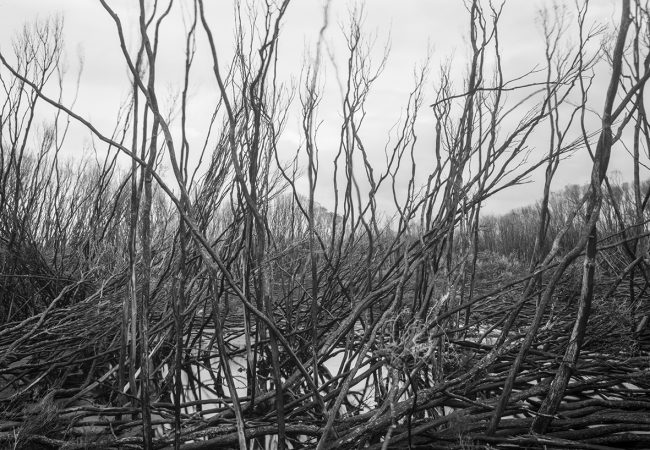
Paperbark swamp. Scan of 4 x 5 negative. This image was made during late March at the Myall Lakes National Park. Melody and I camped for a week at Mungo Brush where a family reunion with her cousins was held. Several generations of her family had lived around the lakes and on the river. The area around White Bay had in recent years been burned by bushfires and seems to be now thriving. The swamp was also once a source of freshwater as the lakes are tidal and can be quite brackish. Facebook. Instagram.
Ian Raabe
Lunette trees. 20 x 25 cm silver gelatin print from 4 x 5 negative.
Thanks again David for curating another interesting exhibition, with wonderful still life compositions, intimate landscapes and the wider landscape. Nice to see some new names and people practising tradition-hybrid techniques as they express their personal visions.
Nice exhibition Dave. There certainly is a lot of talent out there.
I am interested to know which pigments Stuart used to make his tri-colour carbon print ?
Regards,
Andy.
Thanks for that Stuart.
I have always used inorganic pigments from Hanfstaengl, Auto type, and polaroid. They are based on Zinc and Cadmium oxide for the yellow, cinnabar quinacridone for the magenta and copper phthalocyanine for the cyan. No black required.
When Dr Green and I tried coating our own pigments by various means we found it was difficult to get all the sheets to sensitize to the same speed and contrast. These were solved by using a coating machine. How did you solve the issue when doing a batch of pigment sheets ?
Regards Andy.
Hi Andy, contrast of each tissue is managed through dichromate concentration and linearisation of the digital negative. Colour density and balance is managed through pigment concentration, exposure time and the CMYK profile I have developed for the separations. My process is far from optimised and I have a long way to go yet but am pleased with I have to got to so far, cheers
Hi again Stuart,
You mentioned cmy profile which I can assume means using digital separation negatives. I use continuous tone colour seps made on T-max. Made from masked colour transparencies. The inorganic pigments all receive sensitization in a 6% ammonium dichromate solution at 5 deg C. Once dried, exposed in register to UV light and given a wash off. The amount of pigment mm/ol per square cm is the same for all three. Equal amounts of all three integrate to grey perfectly. I don’t have to juggle anything. Beats me how these pigment manufacturers achieved this. Making several identical prints is possible without much fuss. But the thought of making a hundred sheets of each colour boggles the mind. I have no intention of becoming a pigment manufacturer when or if I run out. But your correct it’s a long road. Dr Green told me in the beginning Tri-colour isn’t three times the agro hasstle of monochrome it’s the cube. He was probably correct.
Andy.
David,
Thanks once again for all your voluntary labour in curating and organizing this exhibition. Its great to see these images that show what photographers are doing.
I love the light on Murray White’s rock forms at Johanna Beach, Great Otway National Park, Victoria; on Mark Darragh’s Brown algae. Yallock-Bulluk Marine and Coastal Park, Victoria; on Mick Lord’s 188 Jubilee Terrace. Peter de Graaf’s Paperbark swamp, Myall Lakes National Park, NSW. Light is also a central compositional element in Greg Wayn’s Burnt out church. Powlett Street (East Melbourne?)
Light is important to analogue photography but using it well with a view camera in the field to enhance and shape the form of the image requires a lot of skill and patience as well as some good luck.


Solid work by everyone , amazing .
Thank you Dominique.
Thanks again David for curating another interesting exhibition, with wonderful still life compositions, intimate landscapes and the wider landscape. Nice to see some new names and people practising tradition-hybrid techniques as they express their personal visions.
Thanks Alex.
A wonderful selection of work from everyone. It just keeps getting better! Thank you David.
Thank you Mat.
Nice exhibition Dave. There certainly is a lot of talent out there.
I am interested to know which pigments Stuart used to make his tri-colour carbon print ?
Regards,
Andy.
Thank you Andy.
Hi Andy, the CMY separations are printed using Derivan pigment inks, https://www.gordonharris.co.nz/category/4266-derivan-inks
and for the black separation I use Black Cat India ink, cheers
Thanks for that Stuart.
I have always used inorganic pigments from Hanfstaengl, Auto type, and polaroid. They are based on Zinc and Cadmium oxide for the yellow, cinnabar quinacridone for the magenta and copper phthalocyanine for the cyan. No black required.
When Dr Green and I tried coating our own pigments by various means we found it was difficult to get all the sheets to sensitize to the same speed and contrast. These were solved by using a coating machine. How did you solve the issue when doing a batch of pigment sheets ?
Regards Andy.
Hi Andy, contrast of each tissue is managed through dichromate concentration and linearisation of the digital negative. Colour density and balance is managed through pigment concentration, exposure time and the CMYK profile I have developed for the separations. My process is far from optimised and I have a long way to go yet but am pleased with I have to got to so far, cheers
Hi again Stuart,
You mentioned cmy profile which I can assume means using digital separation negatives. I use continuous tone colour seps made on T-max. Made from masked colour transparencies. The inorganic pigments all receive sensitization in a 6% ammonium dichromate solution at 5 deg C. Once dried, exposed in register to UV light and given a wash off. The amount of pigment mm/ol per square cm is the same for all three. Equal amounts of all three integrate to grey perfectly. I don’t have to juggle anything. Beats me how these pigment manufacturers achieved this. Making several identical prints is possible without much fuss. But the thought of making a hundred sheets of each colour boggles the mind. I have no intention of becoming a pigment manufacturer when or if I run out. But your correct it’s a long road. Dr Green told me in the beginning Tri-colour isn’t three times the agro hasstle of monochrome it’s the cube. He was probably correct.
Andy.
David,
Thanks once again for all your voluntary labour in curating and organizing this exhibition. Its great to see these images that show what photographers are doing.
I love the light on Murray White’s rock forms at Johanna Beach, Great Otway National Park, Victoria; on Mark Darragh’s Brown algae. Yallock-Bulluk Marine and Coastal Park, Victoria; on Mick Lord’s 188 Jubilee Terrace. Peter de Graaf’s Paperbark swamp, Myall Lakes National Park, NSW. Light is also a central compositional element in Greg Wayn’s Burnt out church. Powlett Street (East Melbourne?)
Light is important to analogue photography but using it well with a view camera in the field to enhance and shape the form of the image requires a lot of skill and patience as well as some good luck.
Thank you Gary.