Folio: Mat Hughes
Beyond Cyanotypes
I recently returned from a road trip around Australia with the family. The trip was several years in the planning and a welcome antidote after being locked down for so long. Soon as the borders between the States opened, we hit the road.
Before we left, in a stroke of good timing, I was asked by the Bayside Gallery, in Brighton to participate in a photographic exhibition. The work shown here is from a folio of sixteen prints that will be on display: Bayside Gallery, Brighton, Victoria: 29 October – 18 December 2022
If I cast my mind back, to a time even before lockdown, I had already begun to feel myself drifting away from silver gelatin printing. It was only when I started to explore the Van Dyke Brown print process, that the idea of ‘colour’, became lodged in my brain.
As you may already know, prints undergo fairly extreme shifts in colour throughout the Van Dyke Brown printing process albeit temporary. Whether it be the mustard colour during development or the red/brown in the fix or the final dark chocolate brown after drying down.
There was something about recognising colour in what I had previously only thought of as being a predominately black & white medium that piqued my interest and refreshed my way of thinking.
These shifts in colour left a deep impression and prompted me to revisit the cyanotype process in order to get beyond the rudimentary toning I had previously done and explore the subtly of colour.
In a second stroke of good timing, Annette Golaz released her excellent book, ‘Cyanotype Toning (with botanicals)’ and this became road trip reading.
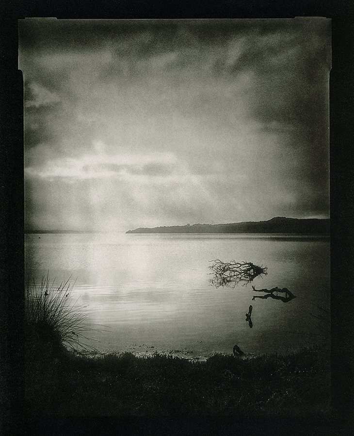
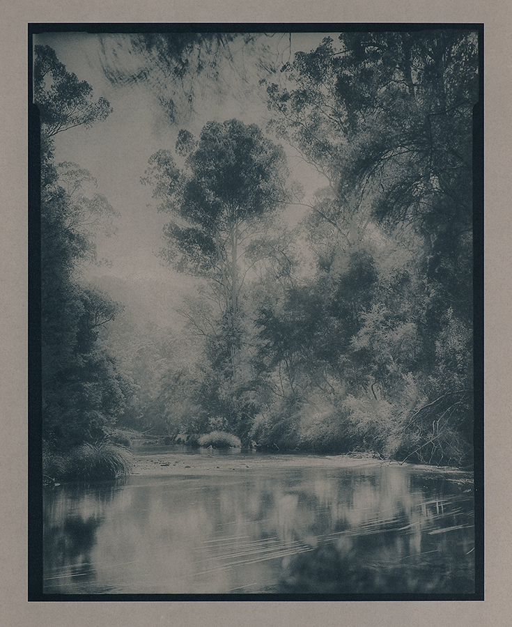
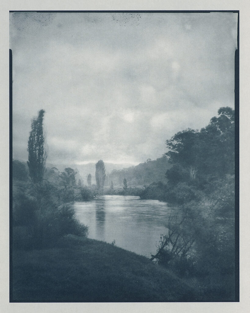
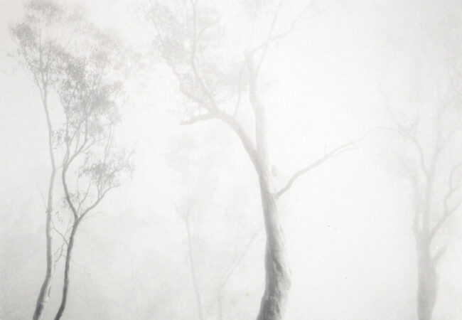
I use a 4×5 view camera and make the exposure to film. These are the slow creative meditations often experienced out in the field that are so necessary and lead to that moment when a composition is recognised.
In my own photographic practice, I have chosen to work with digital negatives, and in this case, I use them to make the contact negative that is used to print the cyanotype before it’s later toned.
Sometimes I wrestle with the idea of a digital component in the middle of a workflow butted by tradition at either end. Then I stop and recall those early artist/photographers who I so admire and take comfort from their insistence on using any goddam tool if it helps with the final vision.
The prints shown below are on 20’x24’ platinum rag although the image area is less at around 30x38cm. This is the limit of my 13’ printer, much larger and I would probably need a vacuum press. Following the advice in Annette’s book it was quickly evident that with the right tools, a fair degree of repeatable control was possible when using botanicals to add colour. Prints this size need at least a 3-litre volume of liquid and roughly 40g of botanical matter which is often used as a one-shot solution.

I find that I’m now thinking of the untoned cyanotype simply as the matrix to the next step in the printmaking process. I never thought of myself as a control freak but gone is the distinctive blue and the painterly brush strokes, these are cyanotypes by design rather than by luck, well at least they are for the moment!

Archival permanence is something that I have to take with a pinch of salt. Of course, I maximise it where I can, but I have no control once the work leaves the studio. Yes, cyanotypes hate bright light, yes, prints are behind UV glass, yes, the botanical toning may shift in colour over time and yes, I apply a bee’s wax polish to the finished print. For these reasons I consider the print as a living thing.
Whilst some of these factors might make some question about bothering with a workflow that is long and complex, the overarching reason for me is very simple, it is done for the satisfaction that I get in making a truly unique piece of work by hand. That is why I do it. A fellow large format photographer from South Australia pointed out that I am actually a printmaker at heart, and I think there is some truth to that.
In a final note that made me smile, I recently read an article pointing out that ink used to print digital negative loses density within a relatively short period of time. I like the idea that even the digital element in my printmaking process is less repetitive than one might think and is subject to change and is therefore perhaps just as unique as any other part of this process.


Mat Hughes The Photograph Considered can be seen here.

Wow Mat – just amazing – love to see the prints 1st hand
Hey thanks Ellie!
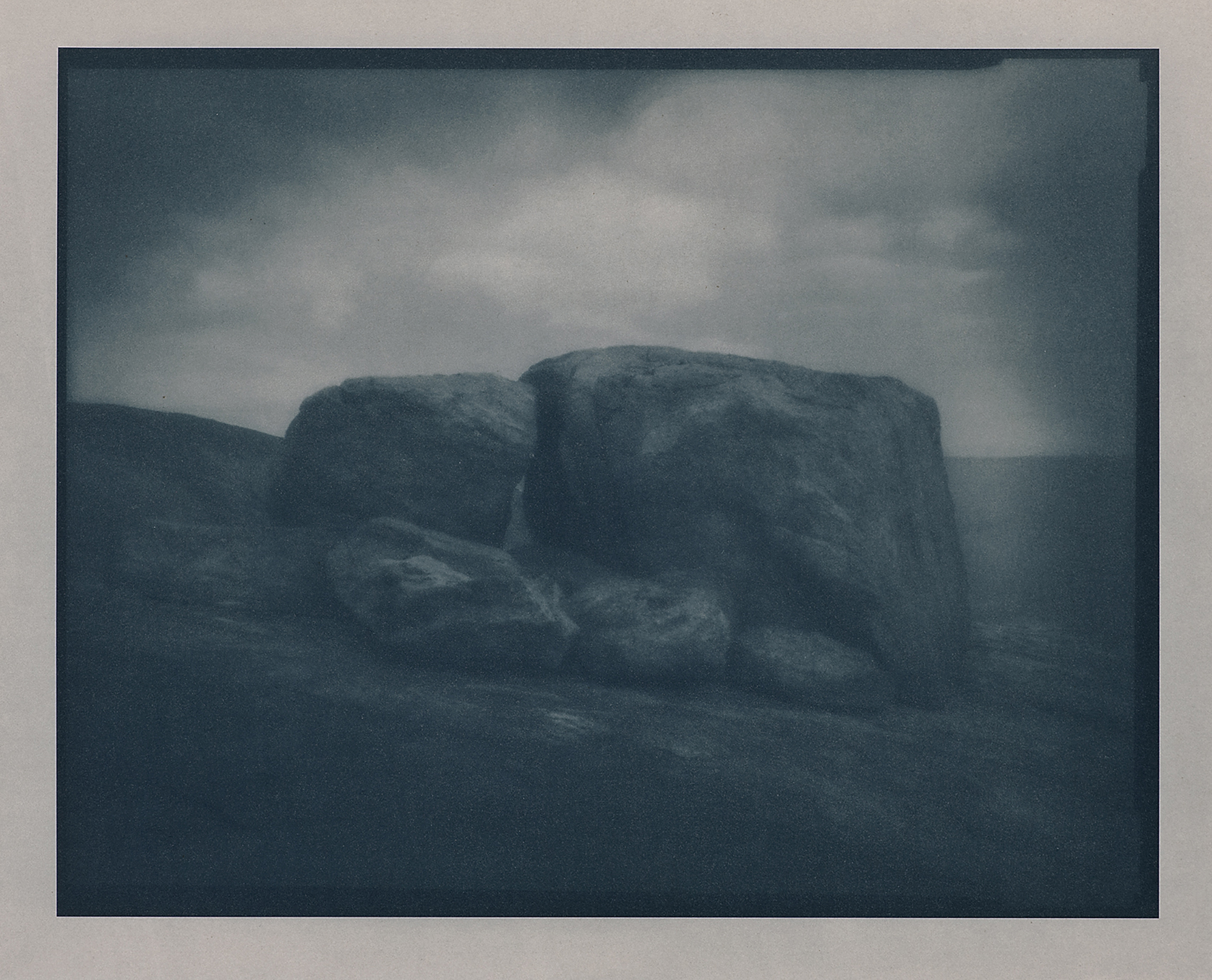
Such a gorgeous looking folio Matt. Best of luck with the exhibition. I will probably be able to see it as I plan to be in Melbourne in the period that it is open. I would love to see some of these prints–my favourite is the very first one–the big rock . Where was that?
Howdy Gary, many thanks, that’s excellent, be sure to give me a shout if you do come over. That was at Thistle Cove in Cape Le Grand National Park, WA. I could have spent a lifetime there!
Outstanding body of prints Mat.
Thanks Shane, much appreciated.
WOW…! Taking 4×5, Cyanotype and Australian Landscape photography to a whole new level… Congratulations Mat…!
Thank you, Doug!
These images are simply stunningly beautiful Mat! Your epic road trip was obviously inspiring. Congratulations and best wishes for the exhibition.
Many thanks Keith!
Beautiful work, Mat. It’s great to get some background and understanding of your printing process too. They look impressive online, I’m really looking forward to seeing them in person.
Thank you, Mark, appreciated. And thanks for taking the time to see them firsthand, so very important nowadays.
To see this body of work in person, in a well thought out space was a great experience, I enjoyed these very much Mat, we’ll done.
Cheers Danny, thanks for coming along, really pleased that you enjoyed it.