View Camera Australia has been online since 2017 and despite there…
Digitising artworks – Kate Baker
I am by no means an expert but here is what works for me. I am improving this a little more all the time as I learn the nuances of what works and what doesn’t.
How I digitise my photographs.
There are a few phases involved and several things to consider:
- Setting up your artwork and a device to photograph it
- Lighting the artwork
- Matching the colour balance
- Correcting perspective if necessary
- Format for saving – with max flexibility for future uses
Setting up your artwork to be photographed
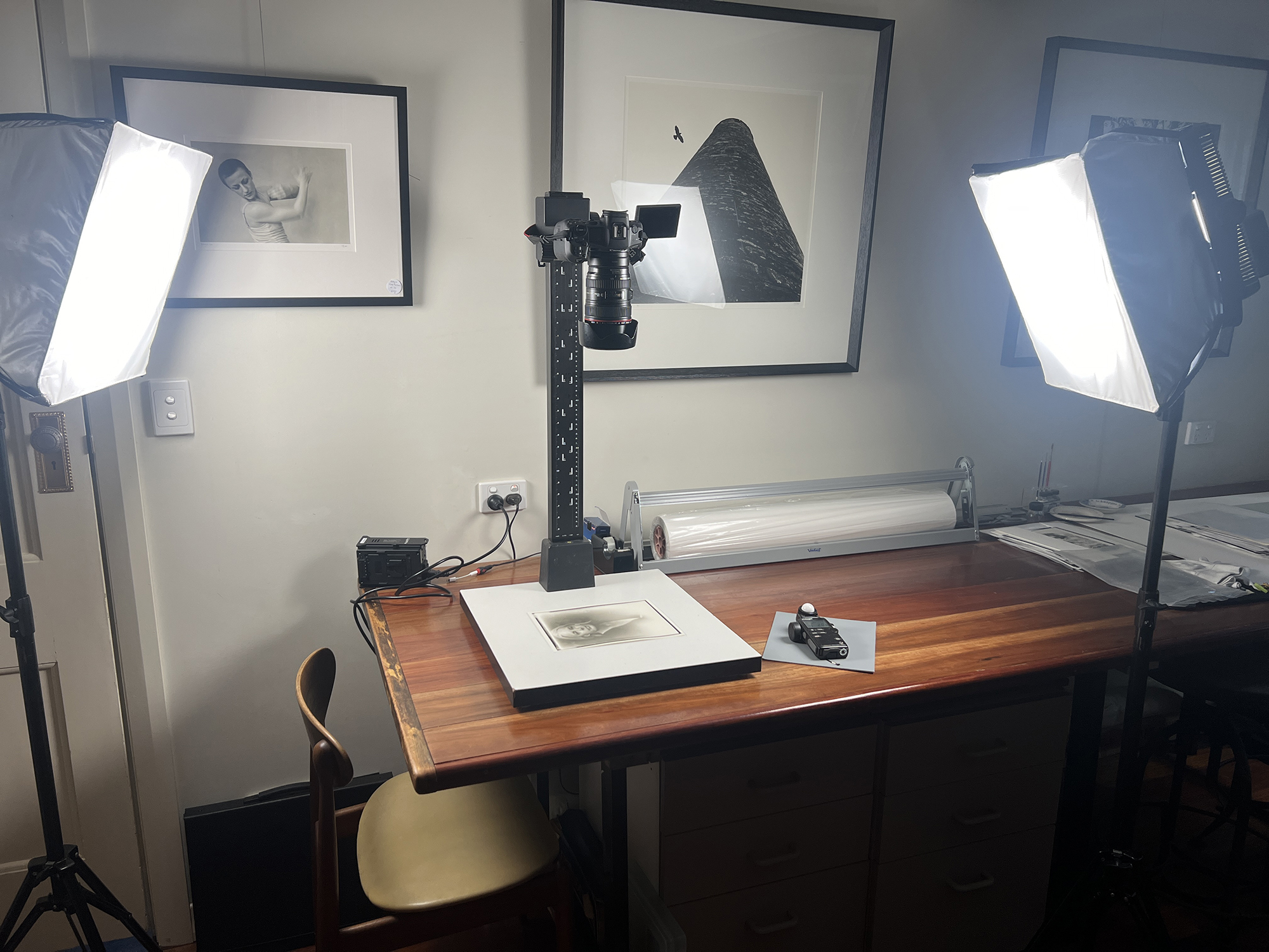
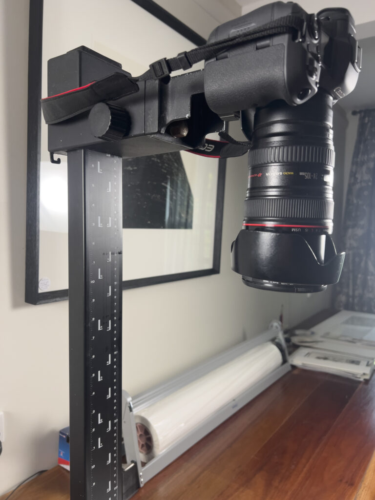
I was gifted an old medium format enlarger with a copy stand capacity I took off the enlarger head so I now use that for photographs where I can. Before I had this, I used to prop them up on something that allows the photograph to be flat (usually on an angle so it doesn’t fall down) and set up my camera to be as perfectly in line with it as possible. It is possible to correct perspective later but always easier in the end to get it right in camera of course. I also make sure my photograph is as flat as possible – waves in the paper make it really difficult to correct.
Use a tripod if you don’t have a copy stand.
Make sure you are set up to make the photograph with the highest resolution possible (such a pain to have to do it again later if your image isn’t bit enough for example, a physical gallery catalog or media promo)
Lighting the artwork
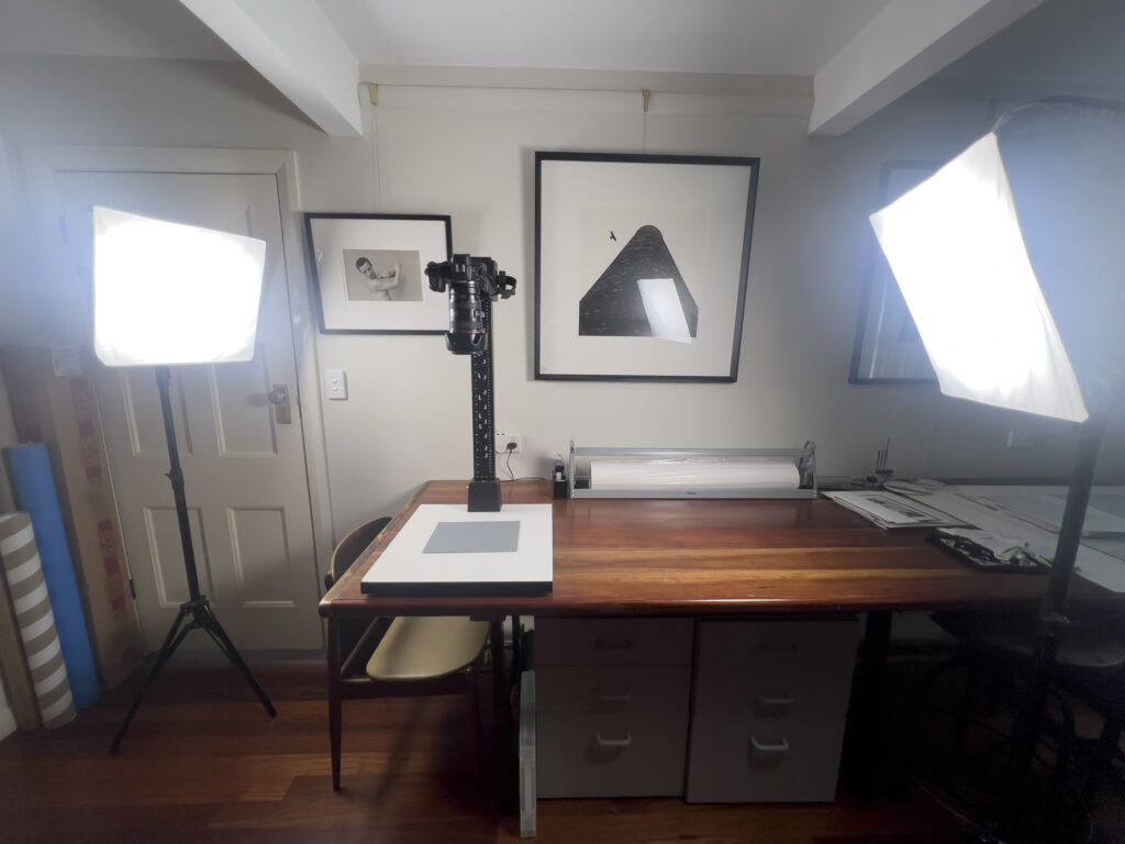
Basically you want the light to be even. Before I had lights I used to use window light and a white reflector to even it up. By having two lights across from each other any shadows any flare tends to be eliminated (which you want).
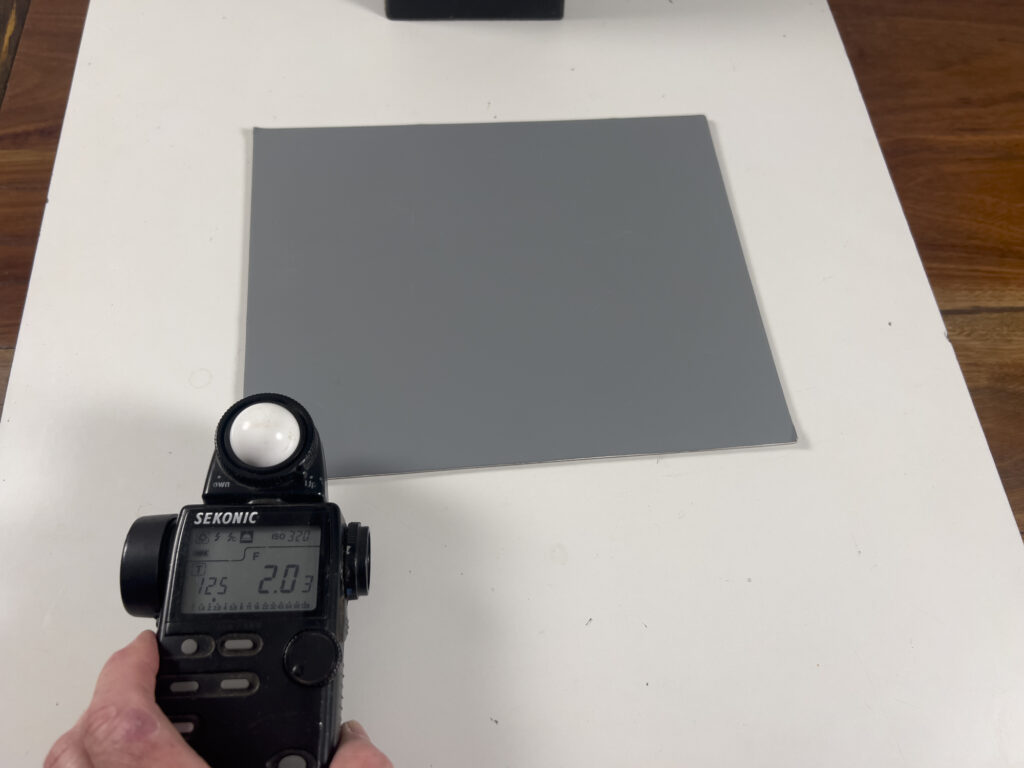
Because now I have lights I have created a set up that works for me and I use a reflective light meter to measure light at all 4 corners of the artwork once the light is set up to ensure even illumination – if not perfect I adjust my lights accordingly until it is right.
I make sure before I do all this that I turn off all overhead lights and only leave on the lights I am intentionally using for the artwork (it’s really annoying when you forget and wonder later why there is glare where it shouldn’t be).
Matching the Colour Balance
This is important if your prints are anything other than pure neutral grey black and white. I use warm tone papers and so my prints are never purely neutral grey. There are a few ways to do this. If you have a digital camera there is often a way you can adjust the colour balance using a grey card – I have a Canon R5 and this lets me match the colour balance to a grey card once I have my lights set. Google it and there are Youtube videos that will explain how to do it with your own digi. I have found this has dramatically improved my digitised images, though I sometimes still need to do some further correction in Photoshop later. So, if you don’t have a way of colour balancing in camera, I suggest using Photoshop. How I do it is, with print by my side, I adjust Levels first. Then there are a few ways to adjust the tone. If for instance it is just a little too warm you may find reducing saturation gets you to the perfect tone. Or you may want to try Image – Adjustments – Black & White – Click Tint then click on the colour square and select a point within the square that is what you are looking for – or put in a hex number e.g. 0b0801which is a nice warm tone but not too brown tone for warm tone images.
Correcting Perspective if necessary
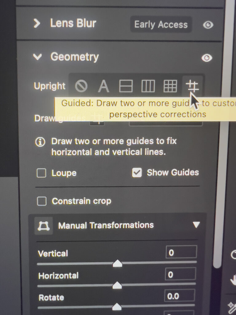
Hopefully you are already perfectly aligned but I find I often have it not just perfectly right, so again I adjust perspective. I find it easiest in camera raw – it has a Geometry adjustment – I like the option to draw two or more guides, works really well and then I crop perfectly.
Format for Saving
Save as full 300 ppi resolution at maximum size first of all. If you want to avoid lossy jpgs, save as a tiff. Use a decent file convention for your files to make your life easier when you are looking for specific image files. I save the first version in Adobe RGB as a base profile. (If you need to change profile in Photoshop – go Edit – Change to Profile – Adobe RGB)
E.g. title-300ppi-fullsize.tif – if I need a print version later of a specific size I go to this file and then Save as title-highres-15cm.jpg (at whatever dimensions you have been asked for e.g. 15cm on longest side in this example)
Then once you’ve saved that you can save different versions.
E.g. I like to save also a web version – I change the profile to sRGB (in Photoshop go to Edit – Change to Profile – sRGB). sRGB is optimised for web viewing. I personally like to save my web images as 100ppi as Macs have 96ppi resolution but I know 72ppi is also pretty standard. Again I have a naming convention including the pixels of longest side – e.g. title-web-2000px.jpg
Everyone seems to want file of a different size hence this naming convention saves you time when you looking for an image of the size required.
So as a summary you might as well save right up front (in order):
Title-300ppi-fullsize.tif (Adobe RGB)
Title-300ppi-highres.jpg (Adobe RGB)
Title-web-2000px.jpg (sRGB)
Title-web-1080px.jpg (sRGB)
Tip for Image Formats for Magazines and Print Press Publications
Sometimes you will be asked for CMYK files.
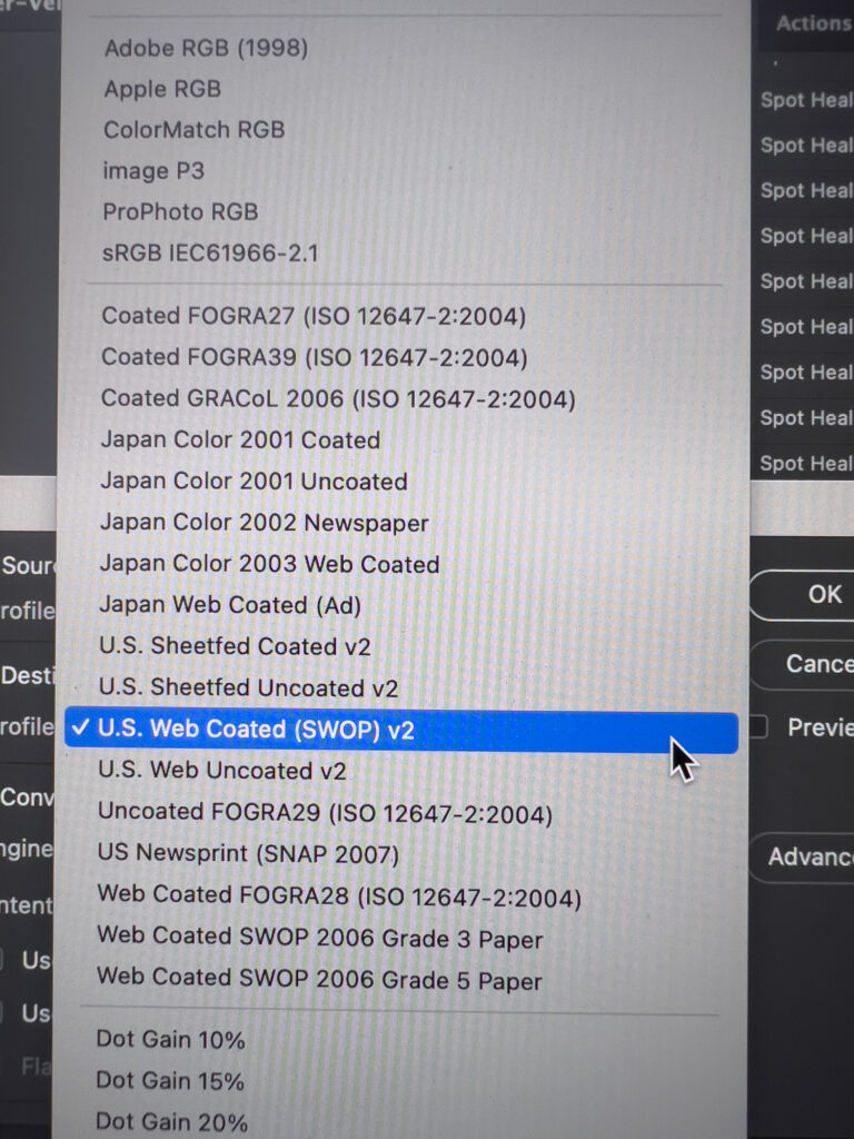
It makes a difference what Colour Profile you save your image in. Start from your original high res TIFF file.
Find out if they have a recommendation for Colour Profile – if it is a coated paper publication ((vs. completely matt) as a generic profile I use US Web Coated SWOP v2 (see image). If it is a matt publication I use the US Web Uncoated v2 option.
In my experience, print publications make the image appear flatter that it looks on your tiny computer screen so I increase the brightness by 10-15% to account for that – the photographs in the magazine publication then look as they should vs. dull and lifeless.
Final Thing.
It sounds all very complicated here but it isn’t really – just follow the steps and get your own groove and you will avoid a ton of wasted time later.
Hope that helps.
If you have better suggestions to streamline/simplify things more, please let me know as I would love to know too!
Next Post: Workshop: C41 Colour processing
Previous Post: View Camera Australia online exhibition March 2024
