In terms of photographic expression, most of us here know that printing is integral and cannot really be separated from the overall process. I have written before about the horror I felt at the possibility of not being able to print during Melbourne’s Covid lockdown. Luckily, I was saved by a Gold Street Studio ‘Van Dyke Brown Printing kit’ stashed in the back of my desk drawer. Since I don’t have a darkroom, I’d have probably gone bonkers if I hadn’t discovered the kit!
That was three years ago. Looking back, I pretty much knew that Van Dyke Brown was special. For me, it was a missing piece in the jigsaw, one that fitted the direction the work was taking me in.
And of course I liked that I could work from home with modest equipment, and I loved the choices of paper and the inky dark tones, all that. I might be wrong, but I also thought I detected a sense that Van Dyke Brown was taken for granted, perhaps overlooked and in the shadows of processes with instant pizzazz, like tintypes and others. I had even heard Van Dyke Brown described as ‘the poor man’s platinum palladium’!
Whatever you might think, there’s little doubt that most brown photographs carry baggage. Mostly by those who are unfamiliar with the subtleties of these old processes. Its brown… its old… its faded… bored now… can we go…
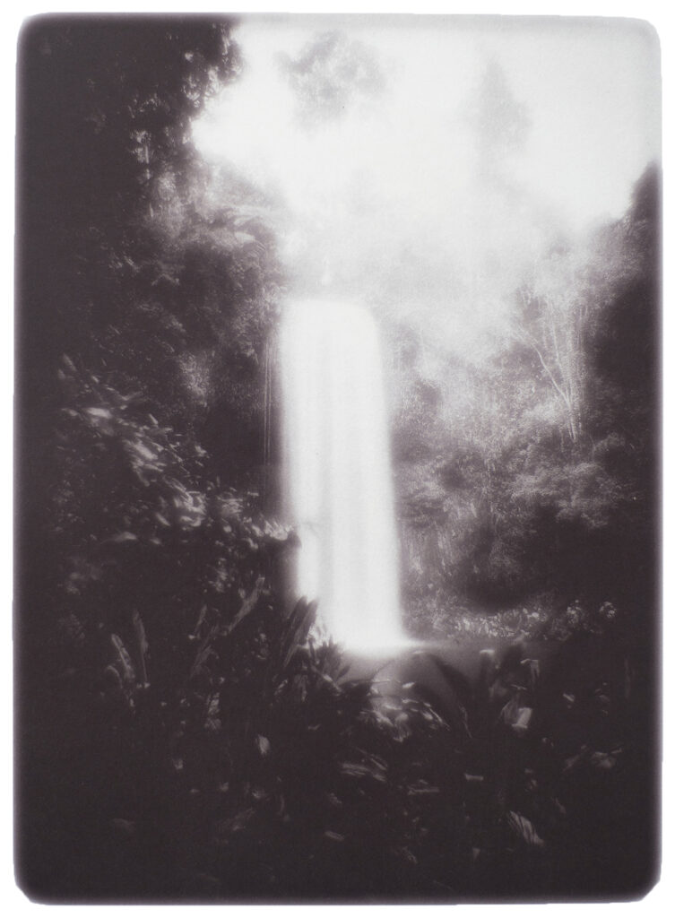
Millaa Millaa Falls. Queensland 2022. 32 x 26 cm.
Anyway, the subject I wanted to share with you is not really the Van Dyke Brown process at all, it’s something more subtle. I find writing consolidates my thoughts, so bear with me. In fact, grab yourselves a beer and join me while I share a few thoughts.
Before I start, for context: Stylistically, my work is influenced by ‘them old’ Pictorialists. They were the ‘mutt’s nuts’. Unlike them, I have access to digital technology. This creates a unique convergence of old and new.
Hybrid Workflow (traditional/digital/traditional)
Traditional large format film exposure> Digital wet scan of negative> Digital interpretation> Export as large digital negative> Traditional Van Dyke Brown Print Process> Contact printed on hand coated paper> Development/Partial Gold toning/Bees wax finish
Over the last three years my workflow has changed considerably. What I thought of as being a relatively compact process, has changed beyond recognition. As it developed, I found I was faced with crossroads and junctions that made me stop and think about the visual minutia of the path I was travelling down.
These crossroads would challenge me to think about things like ‘authenticity’ and ‘digital interpretation’. They would often end with a big dollop of ‘guilt’ because of the inclusion of digital interpretation into the workflow and I’d wake up in a cold, cold sweat like James Brown.
These challenges are not unusual when old and new collide, but for me, it needed some deep thought until I found a settling point. I would inch forward, probe, digest, and make myriad visual cross-references in my mind in order to find a path to the outer edge of what I deemed as being just about acceptable, constantly feeling my way.
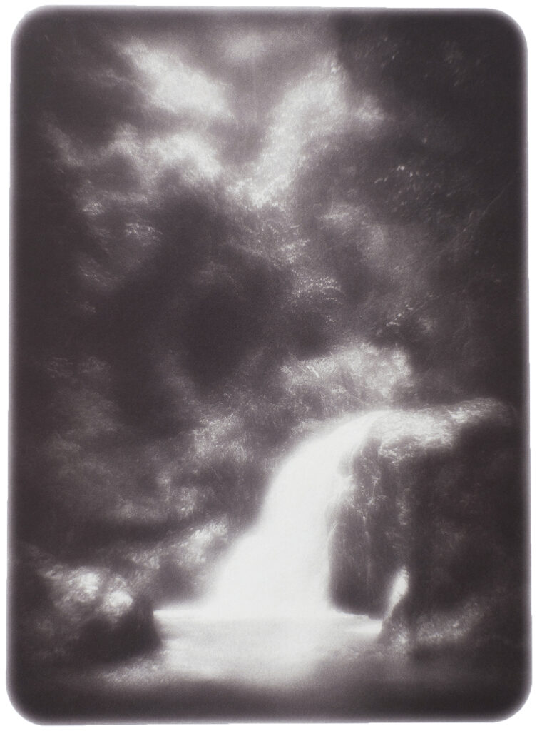
Ponytail Falls 2022. Queensland. 32 x 26 cm.
“If you feel safe in the area you’re working in, you’re not working in the right area. Always go a little further into the water than you feel you’re capable of being in. Go a little bit out of your depth. And when you don’t feel that your feet are quite touching the bottom, you’re just about in the right place to do something exciting.” – David Bowie
Chasing Authenticity
The first crossroad appeared when I started to print with Van Dyke Brown. I printed straight, without correction curves. But that didn’t last long because the rendition and distribution of tones was not to my liking. I consciously decided to use correction curves, because in this modern age I can. This decision was a crossroads of sorts, a deviation from authenticity and the result was to change Van Dyke Brown into something other than its natural state.
I’m reminded of films that are sometimes described as ‘inspired by true events`. Were my prints now, ‘inspired by Van Dyke Brown’!
Probably. It certainly makes you think carefully about the accuracy of what we say in the written description.
In reality, this was not the first deviation, it could be traced much further back. My use of a modern panchromatic film rather than an orthochromatic one from circa 1880 was a deviation, as were the modern optics, fast shutter speeds, film processing and camera exposure…
A side thought for you: just how did those old-timers calculate their exposures given the clumpy tones in a Van Dyke Brown print? I have yet to find any historical reference that describes the end-to-end process in detail. I can only assume the authenticity I thought I was thinking about was probably just a case of the old time photographer ‘getting what you get, and not getting upset’.
It’s so different to the iron-fisted control freakery we assign to ourselves today. It was important to recognize that any attempt to appropriate the idea of authenticity was dead in the water right from the get-go.
Perhaps authenticity is an easier thing to hang your top hat on when it’s ring-fenced to just the printing. Nevertheless, it was reassuring to know there exists a whole other world of natural and uncorrected picture making out there still to be explored… this is the type of visual minutia that interests me!
Wallaman Falls. Queensland 2022. 32 x 26 cm.
The Digital Dim Room
Plotting a workflow from traditional through to digital and facing down ‘digital interpretation’ demons was fascinating too. I come from perhaps the last generation who worked in commercial darkrooms. My natural inclination for any photograph that’s taken into a computer has been to employ similar, basic, darkroom corrections albeit via Photoshop. I`m not a Photoshop Pro by any stretch.
But this all changed after spending time establishing accurate correction curves for the Hahnemuhle Platinum rag/VDB combination I was using. I found I became more assertive and my creative confidence with Photoshop grew, partly due to the responsive nature of a well calibrated process, but mostly as a result of how I saw the various Photoshop actions translating through to the finished print.
Now this next bit is a matter of conjecture and really depends on the individual’s capacity to incorporate digital into their workflow. When I think of the computers place in all of this, I liken it to the surgeon who`s steady hand operates on a patient thousands of miles away with the use of technology and robotics. A conduit. A tool. Furthermore. A trick is missed if the starting point is an assumption that digital tools can be used in identical ways between different printmaking processes. An example might be the sharpening tool. It’s a tool that’s best used sparingly in a normal end-to-end digital print context. However, in a Van Dyke Brown context with a pictorial style overlay like the work presented here, the sharpening effect feels more akin to the action of skimming a photogravure plate with paper for cleaning up detail. Similarly, with shadow and mid-tone dodging tools, that subtly pull out density without imparting the same bruising effects common in digital prints.
I made a connection with manual surface manipulation common to many printing processes. Any guilt I might have had in peeling back pixels diminished as this new relationship developed in my imagination. Familiar tools with slightly unfamiliar outcomes. Suddenly, embracing the digital component made the whole proposition a heap more interesting.
Crystal Cascades. Queensland 2022. 32 x 26 cm.
Absolution of guilt
It’s worth reinforcing at this point that pictorialism is where I’m at. When I speak of the embracing of a digital element, I’m not talking about copying and pasting Godzilla on to the side of Steichen’s flatiron. My own work sails visually close to tradition and will always at its heart be recognizable as photographic. But that’s not to say I won’t drift further out as time goes on, but for the moment I’m leaving others to explore the possibilities of photo-realism, or the more fantastical side of Ai generated imagery. I hope some of these will translate through to be printed with a traditional photographic process.
The key piece of information in all of this is the simple realization that ‘traditional pictorialism’ and ‘image manipulation’ have historically been totally aligned, and I had overlooked this fact.
In his 1946 book, ‘Pictorial Composition in Photography’, Arthur Hammond writes:
“…pictorialism is not the more or less literal presentation of a scene, as is the penchant for today’s relentless realism but it is rather the photographer’s ‘interpretation of a scene”
“…the object of the picture maker is to express-not actual facts-but the emotions which these facts arouse in him”
“…if pictures are to show any individuality and are to ‘convey a mood rather than impart local information’ the process must be carefully controlled and guided at every step”
Leonard Missone gets in on the action in this essay from, ‘The American Annual of Photography 1935’ writing:
“…I cannot end without saying a word on the legitimacy of retouching, because the present tendency is toward pure photography without any interpretation. I will say that I have always had the most liberal ideas in this respect. Retouching appears to belegitimate when it is not visible and I not only wish that it shall be invisible, but that the picture shall never lose the marks of its photographic origin”
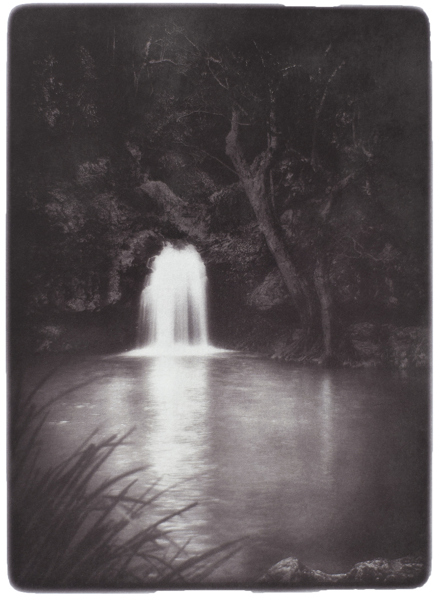
Ebor Falls. New South Wales 2022. 32 x 26 cm.
Almost Finished
A final surprise that can test assumptions, is the idea that because something is digital, it somehow has less value due to repeatability. This is not the case with digital negatives. Whilst research is thin on the ground, it’s already known that a digital negative will lose ink density and fade relatively quickly. This is a legitimate gateway to editioned work.
And lastly, for those who wonder why I don’t simply use a digital camera for the whole thing, it’s due to the fitness benefits associated with hefting a large format camera over hill and dale, nah! It’s mostly because of picture resolution. Whilst it’s certainly possible to do, I would point out that a full frame DSLR has a resolution somewhere around 280ppi while a wet scan from 4×5 negative is made at around 1200 dpi. Take your pick, the end results are just… different.
Mat Hughes exhibition: This time, this place. Tacit Gallery, Collingwood. 1 -18 March 2023.
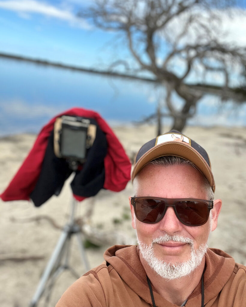
Mat Hughes with 4×5 camera.
Mat Hughes
Recipient of the TACIT Still Life Prize 2021 – Curators Prize.
“We are all visitors to this time, this place. We are just passing through. Our purpose here is to observe, to learn, to grow, to love… and then we return home.” – Australian Aboriginal Proverb
Mat Hughes is a Melbourne based photographic printmaker. Originally from the UK, now based in Elwood.
This body of work comprises of ten handmade prints. Working with traditional large format cameras, compositions are exposed on sheet film. Mat’s practice bridges traditional and digital technologies. These works have been printed using the Van Dyke Brown process patented in 1895. Paper is coated by hand with light sensitive emulsion, exposed, developed, toned with gold, and finally finished with a bee’s wax polish.
Mat Hughes is a pictorial printmaker in the traditional sense. Working mostly in landscape, he has less interest in today’s tendency to depict objects more or less literally and instead seeks to interpret the emotions, beauty, and impressions that a scene may arouse. To a large extent, the artist in photography is handicapped by the fact that the camera is essentially a very efficient copying machine. The artist therefore must learn to control the medium every step of the way with an instinctive sense of what is beautiful in line, form and tone and seek out the essence of simplicity and balance. The artistic process presented in these works cannot therefore simply be thought of as the automated actions of a camera. These works move across disciplines and set a place at the printmakers table. A sharp reminder that modern photographic printmaking that combines handmade tradition is an exciting place to be.
Waterfalls is an ongoing project started in 2020 with the Heysen Prize for Landscape, finalist work, Sheoak falls.
Photographer Zo Damage explores Melbourne's bike paths with a 4x5…
There are 4 comments for this article
Murray White
at 11:14 am
Very nice work and insights Mat, I think that with the luminosity of the high key water, all of these images have suggested that the origin of their ambient light is from the water itself. Ponytail Falls certainly says that to me. By the way, I saw two base jumpers hurl themselves off Wallaman Falls at first light one morning; l’m not sure who had the greater adrenaline rush….
Thank you. I’m pleased you mentioned the water. If there was one aspect that drove all these photographs, it was exactly that, the presentation of water. From the outset, this was the driver for this series. Basic principles applied, time of day, zone placement and building composition through shape and form.
Ref Wallaman, interesting Murray, so if you didn’t base jump, just how did you get all your gear to the bottom!


Very nice work and insights Mat, I think that with the luminosity of the high key water, all of these images have suggested that the origin of their ambient light is from the water itself. Ponytail Falls certainly says that to me. By the way, I saw two base jumpers hurl themselves off Wallaman Falls at first light one morning; l’m not sure who had the greater adrenaline rush….
Howdy Murray.
Thank you. I’m pleased you mentioned the water. If there was one aspect that drove all these photographs, it was exactly that, the presentation of water. From the outset, this was the driver for this series. Basic principles applied, time of day, zone placement and building composition through shape and form.
Ref Wallaman, interesting Murray, so if you didn’t base jump, just how did you get all your gear to the bottom!
Thank you Mat, very good explanation of your process.
Thanks David, for the opportunity.