Photographing with an Open Mind What are you photographing? It…
The Photograph Considered number eight – Peter Lee
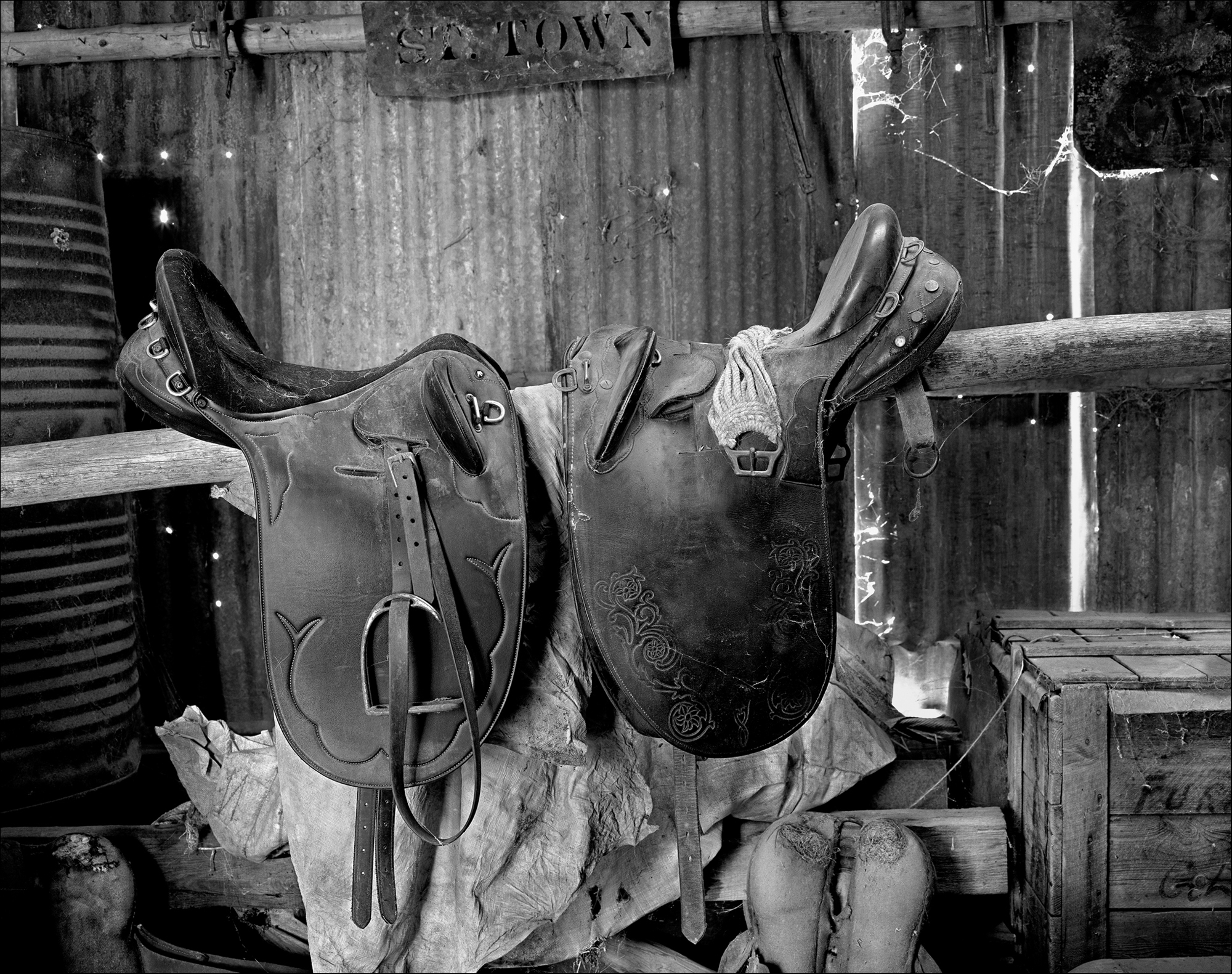
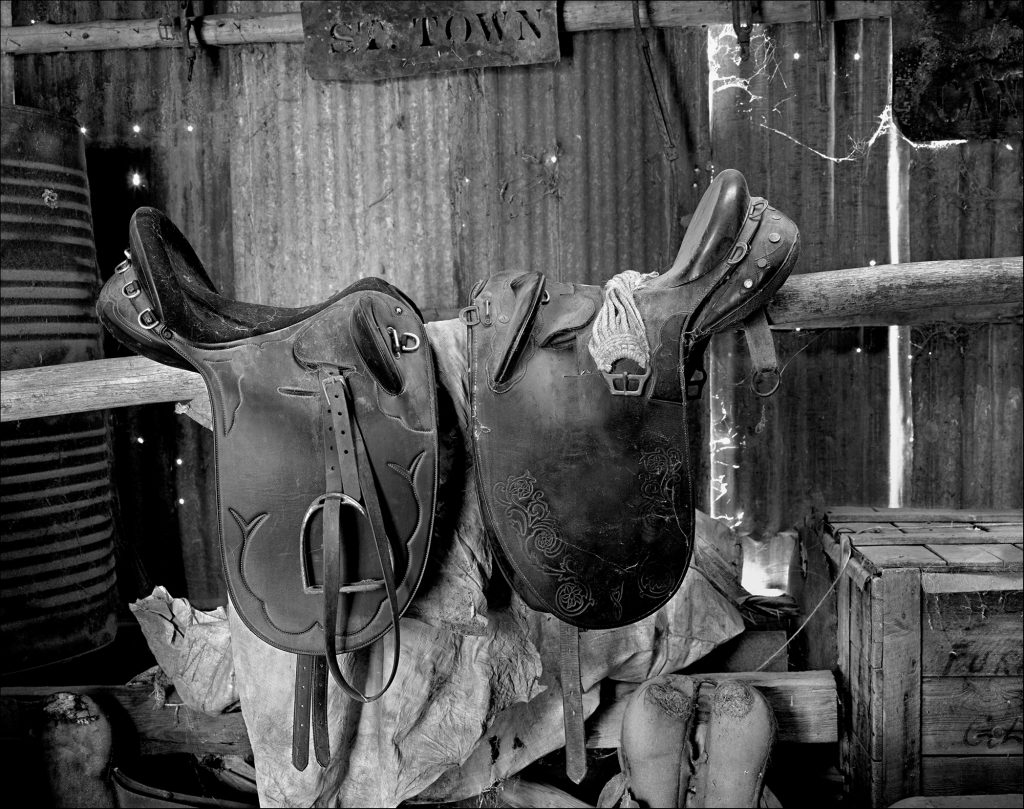
The Saddle Shed. Inkjet print.
This time last year I was invited to take photographs at a remote sheep grazing property on the Bell River some 30kms from StuartTown. Horses are indispensable in this rugged drought affected country and the saddle shed is an integral part of the property’s overall operation. My intention was to document important buildings and landscapes on this property with a large format camera in order to keep a “closed loop” – I would have needed to outsource scanning if I had used a medium format camera.
Exposure and development
I set up my 4 x 5 Crown Graflex with 135 Schneider Symmar S lens inside the saddle shed. As I had anticipated some very long exposures in other sheds, the only film loaded was Fuji Acros100 .The bright sun was already high in the sky and was bleeding through gaps in the iron walls, lighting up the dim dusty interior of the shed. I misjudged how much these narrow shafts of strong light had biased the incident light meter resulting in an incorrect exposure reading of 8 secs @ F32, at least one stop underexposure. Back home, I developed the film in Rodinal 1:50 with minimal agitation but, concerned about the excessive contrast in the scene, reduced the development time far too much, resulting in a partially underexposed/underdeveloped negative. Whilst the negative had low density and contrast, some shadow details were present.
To come up with an acceptable print even in a darkroom would be a challenge.

Workflow
I used my usual workflow for large format work, scanning the negative with my Epson V700 scanner, editing in Photoshop then making the final print on my Epson 3880 printer. Details of the structured workflow is as follows:
Global adjustments
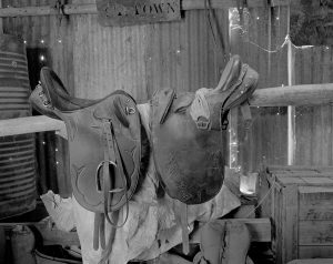
I scanned the negative at 1600 dpi as a linear positive, setting the black point at 0, white point at 255 and the gamma (midpoint) at 1, opening the 16 bit grayscale tiff in Photoshop. I then created a Levels layer, reset the black point and white point to align with the histogram then adjusted the midpoint until I was happy with the result. On a new layer I straightened the image, resized it to 14 by 11 inches, then used the spot healing brush to remove dust/ spots (for white spots the darken mode and for black spots, the lighten mode). I then flattened the image, renaming it as my stock file, and made a 10 by 8 print to use as a reference point for future edits.
Broad adjustments
From examination the stock print, I could see the tonal values in the mid tones and shadows particularly in the lower half of the image, were “muddy” and that a number of sections of the image had to be improved independently of others. To address this , I made a series of luminosity masks, eventually deciding on 3 masks to boost the tonal range of key areas without influencing others e.g. a Zone 3 luminosity masks would enable me darken specific areas of the saddle or anything around Zone 3.
I then painted on the masks with a soft white brush or used a curves adjustment which would only impact on the white or partially off white areas ( i.e. black conceals , white reveals).In other areas, I made a number of curves adjustments, inverted the masks (to black ) and selectively painted on those areas with a low opacity brush building up contrast with each stroke. I saved this file as a PSD which would allow me to come back later and make any adjustments if required.

Local adjustments
Some fine tuning at this point was necessary so I flattened the image and created a new layer and applied the history brush using a number of blending modes, painting on selected areas with a soft brush around 6-10% opacity. The history brush blending modes most used are –
- Multiply– darkens local areas.
- Screen– lightens local areas
- Colour Dodge-lightens light/white areas only
- Colour Burn– darkens dark areas and shadows only
- Difference – Darkens extreme highlights
- Soft Light– increase contrast in local areas
In practice, some example of this are:
- I painted on the light rope on the saddle and the light canvas under the saddle with the history brush in both the screen and colour dodge blending modes to lighten and highlight these areas.
- I painted on the dark parts of the saddle with colour burn and multiply blending modes and the writing on the box and signpost to enhance them.
- I “outlined” some edges in the image, using a very fine hard brush in multiply mode at 15% opacity to separate objects within the image.
Once I was happy with the result , I flattened it and sharpened it using a third party sharpening tool Focus Magic applied through a mid-tone luminosity mask to restrict sharpening to only those areas.
Printing
I decided to print this image on Museo Silver a 100% cotton heavyweight archival fine art paper with no optical brighteners and a high D Max to enhance the deep blacks in the image. I used a custom warm profile by Les Walkling, in this way the slightly warm toning is applied in the print driver rather than Photoshop meaning the print could still be made in Epson’s Advanced Black and White mode rather than the colour mode. I waited 24 hours for the print to dry and applied 3 coats of Hahnemuhle Protective Spray.
 Peter Lee with 4×5 camera.
More of Peter’s work can be seen on his website.


a lovely still life photo Peter
Hi Peter,
Thanks for your description of how you improved your underexposed/underdeveloped negative. Your end result is lovely – certainly worth your time and effort.
Cheers Peter Kinchington (Kanga)