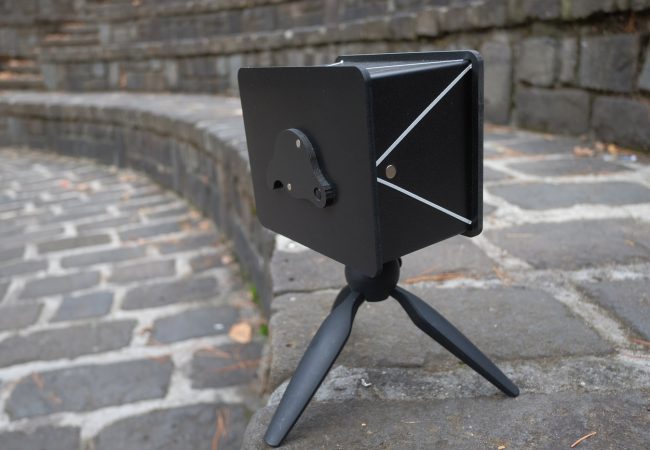
The Obscura 4x5 pinhole camera is Ilford’s second pinhole camera…
Review of Kodak Ektachrome E100 4×5 sheet film by Mark Darragh
Background
Kodak describes Ektachrome E100 as “a daylight-balanced color positive film, featuring clean, vibrant colors, a neutral tone scale, and extremely fine grain. Its distinctive look is well suited to a wide range of applications, such as product, landscape, nature and fashion photography.”
Past generations of Kodak and Fujifilm’s respective transparency (or reversal) films had their champions and detractors alike. One thing they did offer was choice; different emulsions, each with it’s own inherent strengths, weaknesses and colour signature.
The decision by Kodak to manufacture a film which is a successor to films like Ektachrome E100G means that photographers once again have a choice, a film distinctively different to anything that Fujifilm has available.
In preparing this review I chose to shoot Ektachrome E100 alongside Fujichrome Provia 100f (RDP III), the most comparable film to Ektachrome of Fujifilm’s currently available transparency films. Provia’s saturation is moderate compared to Fujichrome Velvia films and it has a more neutral colour balance.
What follows are my personal impressions, based on the experience of over 30 years shooting transparency film. In keeping with the ethos of View Camera Australia, it is also very much based on “in field” use rather than an assessment for studio use.
In presenting these comparisons I have endeavoured to cover a reasonably broad range of lighting conditions and colours in the landscape. It should be noted that some of the images, even when the shutter speeds and aperture setting were the same, do show slight differences in overall exposure. This is simply the nature of photographing in the field. At times, rapidly changing lighting conditions may result in slight differences occurring even between taking a meter reading and tripping the shutter or swapping between sheets in a double dark slide.
All of the transparencies were scanned on a Imacon Flextight scanner with identical settings in order to reproduce the colour and tonality of the originals as faithfully as possible.
Colour rendition and Contrast
The most obvious and expected difference between the two films is the colour rendition.
On the lightbox, Ektachrome is cooler across the spectrum but also more neutral. In general, Fujichrome films know for a degree magenta/red cast although in Provia it is moderate compared to Velvia 50 and 100.
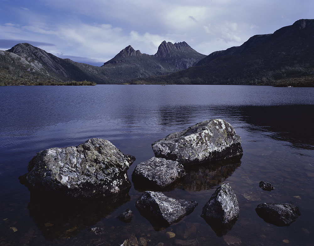
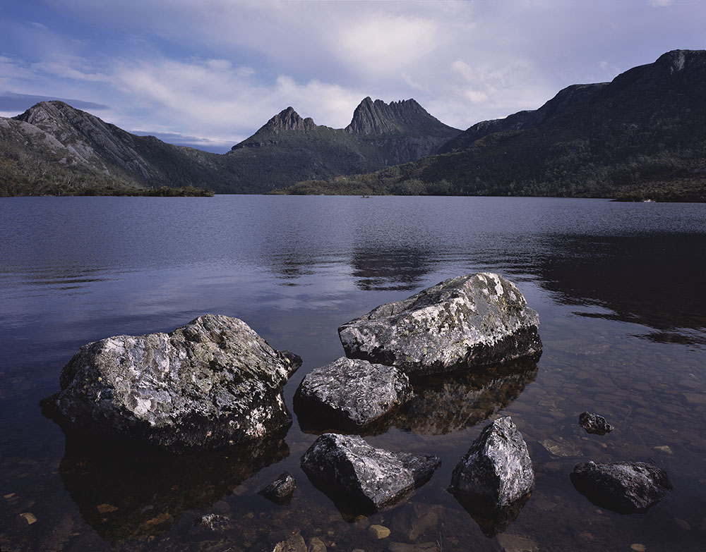
Figure 1 a & b were shot during the late morning with sunlight filtered through high cloud. They provide a good example of the difference in rendition colour between the two films. Ektachrome shows a neutral to cool colour balance whereas Provia is warmer, with a noticeable pink hue in the clouds and lighter areas of the image.


Figure 2 a & b Once again the Ektachrome shows quite neutral greys and light tones in contrast to the warmer colour balance of Provia.


Figure 3 a & b In this instance, the Ektachrome, although it has slight shift to yellow, has done a much better job of reproducing the subtle cream and off-white tones of the lichen.
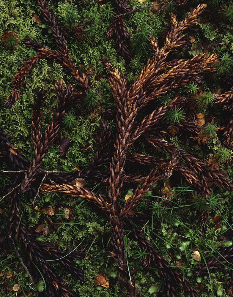

Figure 4 a & b The rich greens of the mosses in these images are typical of those found in Australia’s temperate forests. There are certainly differences in the greens between the two film but in both cases they are reasonably natural. The more obvious difference is in the browns of the King William Pine Needles, with Ektachrome emphasising the yellows and Provia the reds. Note that the Ektachrome shows a degree a reciprocity failure compared to the Provia, more on that to follow.
Ektachrome’s colour rendition will certainly please many photographers who find the Fujichrome emulsions too “warm”. For those wanting to “warm up” Ektachrome, an 81a or b, or light red colour compensating filter could be used. It should also be noted that, although readily apparent, the differences in colour rendition between the two films are not great and could easily be altered during scanning and post production.
Kodak describes Ektachrome E100 as having “a low contrast tone scale”. Having now shot a number of boxes of E100 along with Provia under a wide variety of different conditions, to my eye, E100 exhibits a touch more contrast than Provia.

Figures 5 a & b iIllustrate a situation of reasonably high contrast for transparency film. A 3 stop ND grad was used to reduce the brightness of the sky and sunlight areas. In this example, Provia shows lower contrast and retains slightly greater shadow detail in the vegetation and rock faces below the peaks.
The actual differences between the two films in far more nuanced than simply describing one as neutral and one as warmer. Ultimately, the key to using any film successfully comes down to experience, understanding its behaviour under different lighting conditions and making decisions, for example, whether to employ a filter or not, to achieve the final photograph.
Reciprocity Characteristics
During testing I was able to shoot exposures up to nearly 2 minutes.
Kodak’s data sheet for Ektachrome E100 suggests that no compensation is required for exposures of up to 10 secs, and in practice I found that to be accurate.Beyond that there is currently no official recommendation for reciprocity correction but I did find that Ektachrome does require additional compensation for exposures longer than 10 seconds. For some previous iterations of Ektachrome, Kodak recommended an increase of 1/3 of a stop exposure for exposures over 10 seconds. This was certainly a good staring point but for exposures between 20 and 40 seconds I found that adding ½ stop gave me a better results. To quote from the Ektachrome data sheet, “Use the data only as a guide. For critical applications, make tests under your conditions.”
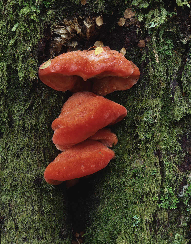
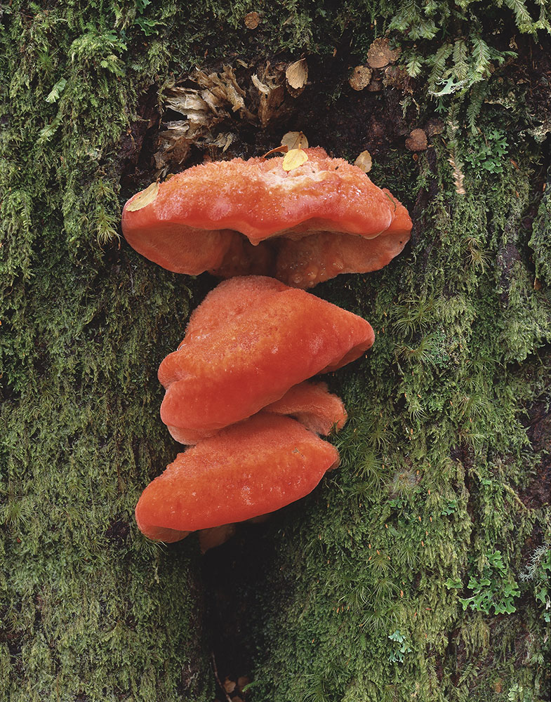
Figure 6 a & b shows sheets of Ektachrome and Provia shot at 30 seconds and 25 seconds respectively. I’m happy with both images but the Ektachrome is slightly underexposed with greater shadow density and would have benefited from an additional 5 – 10 seconds of exposure.
Provia is unique among current production transparency films, with outstanding reciprocity characteristics. No exposure compensation required for exposures up to 2 minutes and only an additional 1/3 stop up to 8 minutes.
Push/Pull Processing Characteristics
Push processing several sheets of Ektachrome E100 1 stop resulted in a noticeable weakening of denser areas of the transparencies and an overall “muddy” look to the film. In contrast, Provia handles push processing 1 stop with very well with very minimal change to the tonality and colour balance of the film.
On the other hand, I pull processed a couple of overexposed sheets of E100 1 stop and found the results to be excellent. In the future, if I was doubtful about the accuracy of an exposure, I would be inclined to err on the side of slightly overexposing Ektachrome with the knowledge that a second sheet could be pull processed if required. Again, these are simply based on my experience and each photographer really needs to make there own judgment based on their workflow and desired final image.
Pricing and availability
In Australia, colour transparency sheet film has long been disproportionately expensive compared to other markets. The last time I priced a box of 4×5 Provia 100f at a retailer locally, it was priced at around A$200. The same film sold in the USA for US$74. Given the exchange rate at the time, the cost per sheet was double.
Currently in Australia, a 10 sheet box of 4×5” Ektachrome retails for $70-80 which is comparable to the price in other markets. This is considerably cheaper per sheet than a 20 sheet box of any of the Fujichrome films which you would most likely have to source via mail order.
Ektachrome E100 4×5 sheet film is available across Australia at specialist photographic suppliers.
Final thoughts
For many photographers, who worked with Kodak transparency films in the past, the reintroduction of Kodak Ektachrome E100 has been a welcome one. Ektachrome’s unique characteristics set it apart from Fujichrome films and for this reason alone it will likely become the film of choice for many photographers. That it is stocked locally and currently priced well below the competition are additional things in Ektachrome’s favour.
Anecdotally, talking to a number of retailers, there are photographers new to shooting transparency film who have begun to work with Ektachrome since it became available. That in itself is also a really positive thing for the medium and for film based photography as a whole. Compared to colour negative film, the future of colour transparency sheet film has become somewhat uncertain. The reintroduction of Kodak Ektachrome E100 has certainly gone some way to shoring up availability of E-6 film and chemistry into the future.
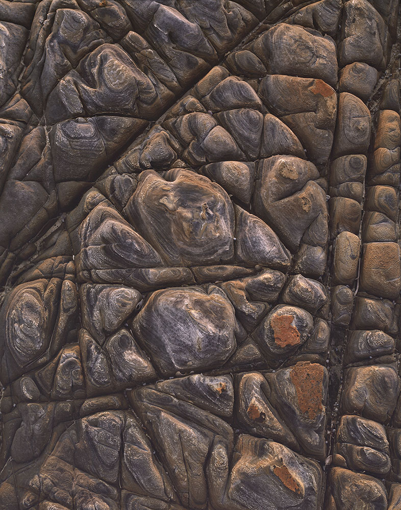
Main photograph above: Morning cloud, Rocky Cape National Park, Tasmania. All photographs by Mark Darragh.
Picture captions
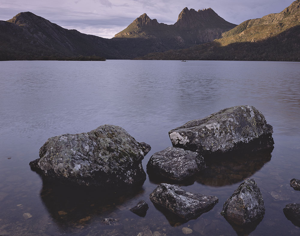
Figure 1a. Kodak Ektachrome E100 – Cradle Mountain and Dove Lake, Cradle Mountain – Lake St Clair National Park, Tasmanian Wilderness World Heritage Area, Tasmania, Australia. f 22, 1/30 second.
Figure 1b. Fujichrome Provia 100f – Cradle Mountain and Dove Lake, Cradle Mountain – Lake St Clair National Park, Tasmanian Wilderness World Heritage Area, Tasmania, Australia. f 22, 1/30 second.
Figure 2a. Kodak Ektachrome E100 – Morning cloud, Rocky Cape National Park, Tasmania. f22, ¼ second.
Figure 2b. Fujichrome Provia 100f – Morning cloud, Rocky Cape National Park, Tasmania. f22, ¼ second.
Figure 3a. Kodak Ektachrome E100 Detail of Coral lichen (Cladia retipora), Cradle Mountain – Lake St Clair National Park, Tasmanian Wilderness World Heritage Area, Tasmania, Australia. f32, 10 seconds.
Figure 3b. Fujichrome Provia 100f – Detail of Coral lichen (Cladia retipora), Cradle Mountain – Lake St Clair National Park, Tasmanian Wilderness World Heritage Area, Tasmania, Australia. f32, 10 seconds.
Figure 4a. Ektachrome E100 – King Billy Pine Needles (Athrotaxis selaginoides) and mosses, Cradle Mountain – Lake St Clair National Park, Tasmanian Wilderness World Heritage Area, Tasmania, Australia. f32; 30 seconds, 81b filter.
Figure 4b. Provia RDP III 100f – King Billy Pine Needles (Athrotaxis selaginoides) and mosses, Cradle Mountain – Lake St Clair National Park, Tasmanian Wilderness World Heritage Area, Tasmania, Australia. f45; 20 seconds, 81b filter.
Figure 5a. Kodak Ektachrome E100 – Morning light, Cradle Mountain, Cradle Mountain – Lake St Clair National Park, Tasmanian Wilderness World Heritage Area, Tasmania, Australia f 22, 4 seconds, 0.9 ND soft grad filter.
Figure 5b. Fujichrome Provia 100f – Morning light, Cradle Mountain, Cradle Mountain – Lake St Clair National Park, Tasmanian Wilderness World Heritage Area, Tasmania, Australia f 22, 4 seconds 0.9 ND soft grad filter.
Figure 6a. – Ektachrome E100 – Aurantiporus pulcherrimus on Beech trunk. Cradle Mountain, Cradle Mountain – Lake St Clair National Park, Tasmanian Wilderness World Heritage Area, Tasmania, Australia f32; 30 seconds.
Figure 6b. Provia RDP III 100f – Aurantiporus pulcherrimus on Beech trunk. Cradle Mountain, Cradle Mountain – Lake St Clair National Park, Tasmanian Wilderness World Heritage Area, Tasmania, Australia f32; 25 seconds.
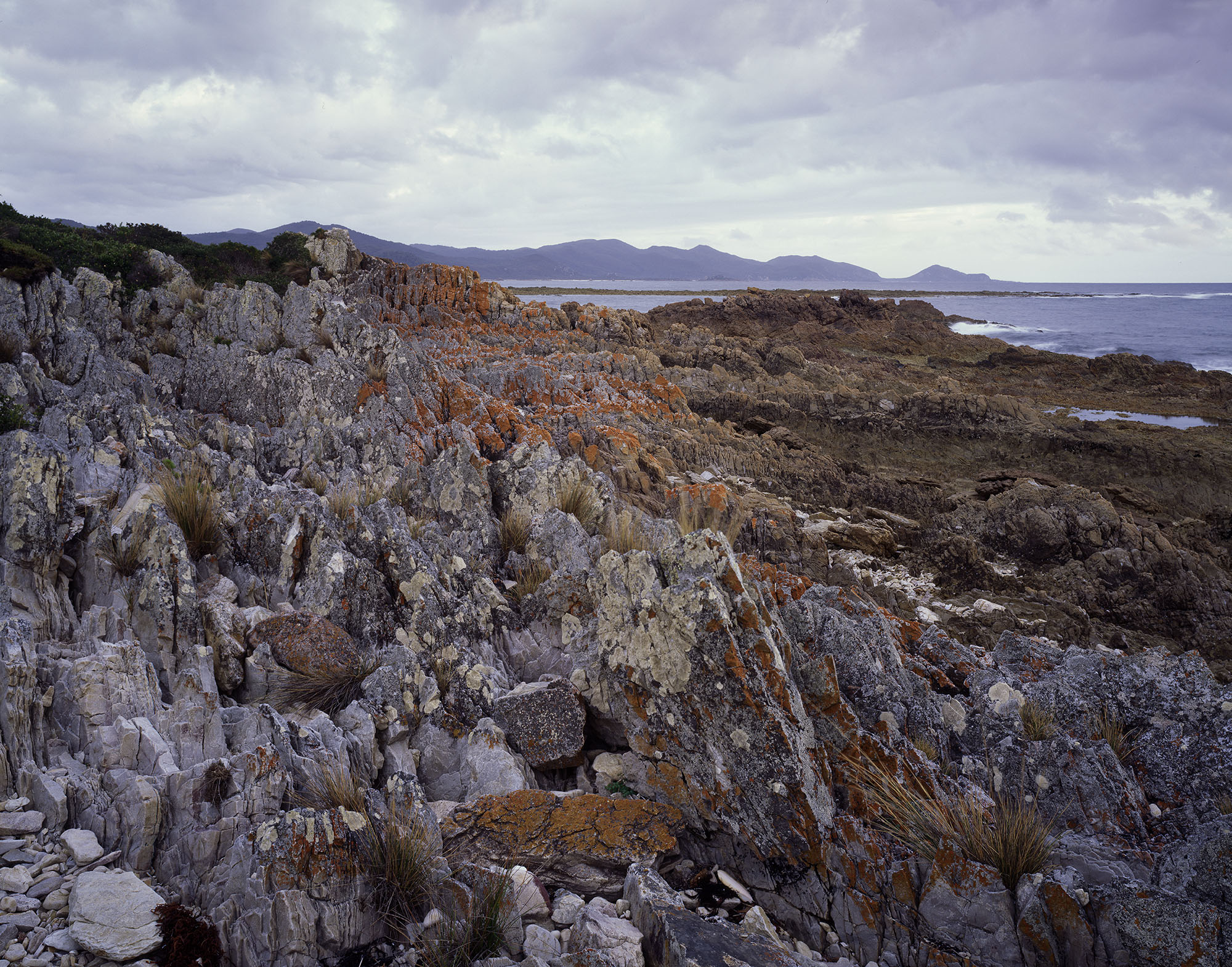
Figure 7a. (below) Kodak Ektachrome E100 – Shore platform detail, North West Tasmania f32, ¼ second.
Figure 7b. (below) Provia RDP III 100f – Shore platform detail, North West Tasmania f32, ¼ second.

More of Mark Darragh’s photography can been seen on his website.
His review of the Acra-Swiss F Universalis 4×5 camera can been seen here.
His The Photograph Considered article can be seen here.
Mark Darragh’s exhibition Relicts – exploring the flora of Gondwana is currently showing at Cradle Mountain Wilderness Gallery, Tasmania until 15 November 2020.
Previous Post: The Photograph Considered number thirty five – Greg Wayn


Mark, congratulations, an extensive and very informative review.
wow so comprehensive
great read
Thank you, David.
For anyone interested in 5×7″ and 8×10″ Ektachrome, it is available in 50 and 10 sheet boxes respectively as part of the Kodak special order program run by Keith Canham of K. B. Canham Cameras in the USA. To be included in a future order Keith can be contacted by email kodakfilm@canhamcameras.com
Mark, thank you for your comprehensive review and comparison to Fuji Provia. The photographs amplify your text well. I gave up on Provia due to its excessive magenta, so your description is appreciated. Best wishes, Rod
Thank you, Ellie and Rod for your kind words.
I’m glad you found the comparisons between the two films useful, Rod. I hope there are many photographers like yourself who appreciate the difference that Ektachrome offers and start shooting it again.
Great comparison. While I personally don’t see any reason to shoot E100 over Provia for landscapes in 8×10″, especially given it’s more expensive I’m glad Kodak decided to release it in sheet film because it’s important to have an alternative, given Fujifilm’s tendency to discontinue emulsions. In 5×7″ it is also currently the only game in town, given Fujifilm has been discontinued in that format for so long even stocking up on expired isn’t an option.
Thank you so much for reviewing this film! (Though I was quite annoyed that you didn’t identify which images were shot with which film until the end of the article, which left me guessing till the end)
I am shooting flat artwork and looking for the most faithful film with which to capture color paintings in large format (5X7). I was so disappointed when Kodak discontinued its 100G film a couple of years ago. I can’t wait to try the new stuff! I am going to try your suggestions on exposures longer than 10 seconds because I shoot up to 25 – 30 second exposures.
Dear Mark and others who commented. When I began calibrating for dye transfer and colour carbon printing inn the early 1990’s I had to learn a great deal about the films I was using to record the images ie the first order result, on which was colour transparency film. Here are some facts not just my personal opinion about the various transparency films.
The propriety processing formula for Kodak Ektachrome films is E6.
The propriety processing formula for Fuji films is CR-56.
Agfa films used to be AP40.
Kodachrome was a non – substantive film that had to be processed by a lab set up to do so.
Just because these films are E6 compatible doesn’t mean the optimum colour balance or density range will be obtained by using a compatible formula.
The magenta often seen in E6 processed Fuji films is due to variations in the pH of the colour developer. The excessive colour saturation particularly seen in the blue/green of Velvia is due to variations in pH of the first developer. Push or pull processing alters the gamma of development which alters contrast. As colour balance is contrast dependent but contrast isn’t colour dependant this can cause variations in colour balance as well. The bi-products produced in an E6 processor when CR-56 films are run through it will cause colour shifts in E6 films. That’s why most labs restrict the number of other types of films run through the tanks between replenishment.
When I conducted clip tests,from several rolls of Kodak Ektachrome 100G of a Macbeth colour patch chart all exposed the same, at different labs none of the curves match one another. The results when viewed in direct comparison were more than perceptibly different. Viewed in isolation from one another most were acceptable. Because of all these differences I had to fine tune my colour corrective masking skills for the various methods of reproduction. I still believe that this is the only way to truly manage colour.
regards Andy.
Thank you very much for the excellent comparison!