
Established in 2015 the Friends of Photography Group is a…
My experience with Ilford Ortho film – Murray White
Murray White’s experience using Ilford’s orthochromic film Ortho Plus
It seems to me that the most durable trends in photography to date are those that have paid homage, at least in spirit, to its traditional past. This medium’s capacity to excite our imaginations through innovative approaches has both driven sustainable progression in exploring the limits of our craft, and been the genesis of countless crazes.
I’m sure that many of us will remember those psychedelic filter effects of the 1980s, where halos, distortions and star-bursts could be coupled in the name of art to any subject we desired. It makes me wonder whether those optical engineers of the day all thought the photographic equivalent of macular degeneration could be the holy grail of photography, or truly expected that superficial intervention would fuel a lasting movement.
Only time will tell whether contemporary practices like I.C.M. (yes, those once frowned upon images of stationary objects blurred by random camera movement have now been elevated to a respectable genre, complete with its own reassuring acronym), or the habitual use of super-wide angle lenses capped with big stopper filters around moving water, have made any substantive contribution to the craft.
In my experience the most lasting photographic techniques revolve around the classic themes: evocative lighting, simple composition and intriguing content. While we may now call these styles high key / low key, minimalism, negative space or some other fashionable term, the search for enduring photographic meaning has prevailed in some form since Joseph Niepce first drilled a hole in his bedroom wall to capture on greasy pewter, a crude likeness of the outside world.
Even today the fascination with photography’s roots still encourage many enthusiasts (in addition to us, the dedicated view camera users), to dabble in its historic presentation, if not the actual processes. And nowhere is this more evident than in the lingering interest of making a monochromatic conversion from a digital capture. I know that at my local camera club the sheer number of B&W prints submitted to competition in no way reflects the number of film users (there are only two of us), but suggests that there is a much broader interest in non-colour representations for all sorts of reasons, perhaps too complex to explore here.
This renaissance of pseudo-darkroom work got me interested in how I might convert some of my own rather large collection of medium format colour transparencies into B&W prints. Surely it wouldn’t be that hard; after all, most camera club members just scroll down their menus, apply a little (or a lot) of post production manipulation, and, Voila! – a perfect file to print on the inkjet.
Some years ago I had a fairly nice medium format scanner (which possibly could had saved the colour scan as a B&W file, I am not sure) but my preference for reasons other than logical ones was to undertake a purely analogue process. And just as my self imposed, but entirely unjustifiable, suspicion of things that seem too clever to be useful compromised my scanner knowledge, I felt a little out of my depth researching inter-negatives on the internet too. So with a pack of Ilford 4 x 5 Ortho film tucked under my arm, and considerably more enthusiasm than skill, I set about making B&W negatives from my transparency stock.
The first problem I encountered was that almost all of my trannies are 645 format, not the 6 x 7 aspect ratio that I use in my enlarger for medium format B&W now. No problems I thought, I will order a suitable mask set off ebay for the Durst enlarger carrier. Very shortly after I received some cheap 3D printed plastic masks considerably more warped than the precisely engineered O.E. metal masks that carry the Durst name, but more disappointingly, the incorrect dimensions for my carrier. Oh well, I then headed into my shed, found some suitable aluminium sheet offcuts and made my own. Gratification with the analogue process had begun.
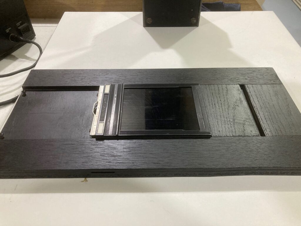
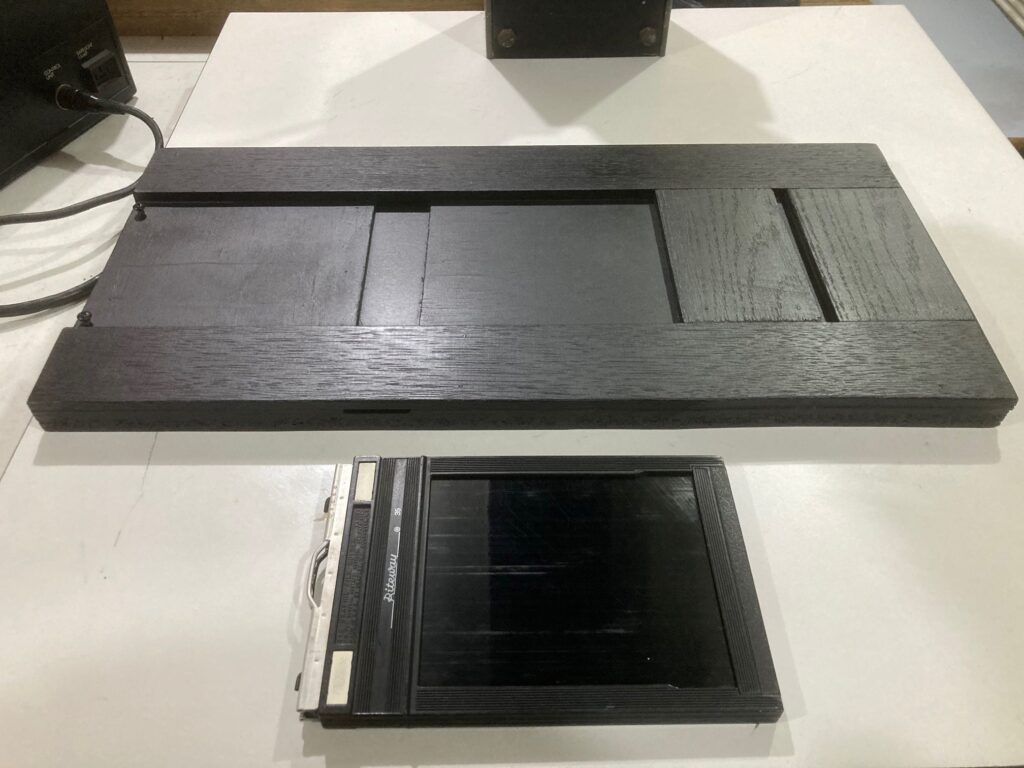
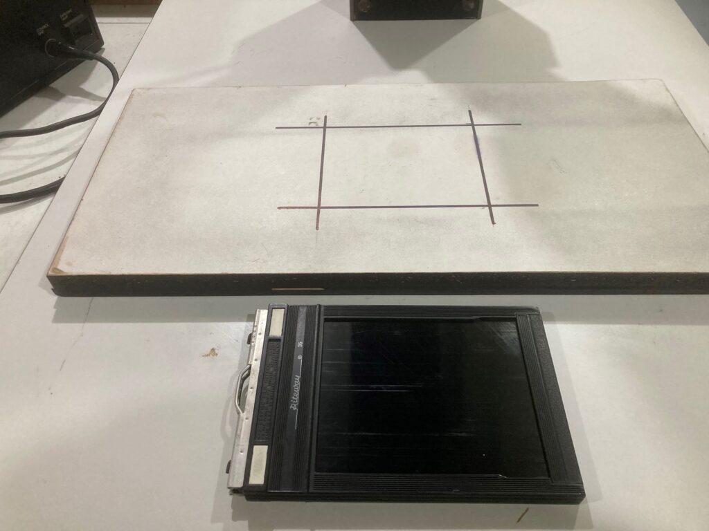
Next step was to make a base to hold a 4 x 5 double dark slide flat on the enlarger base board. I laminated some timber sheets to achieve this, making the finished film plane overall height exactly the same as the support block when inverted without the double dark. This allows me to focus and frame the tranny onto the white coloured base of the block, then turn it over to insert the double dark with the focus preset.
I was ready now to make an ‘enlargement’ onto the 4 x 5 Ortho film, but I didn’t know what exposure time would be required. My solution was to use a spot meter set for 80 ISO (the nominal film speed) and take an E.V. reading of the highlight and shadow areas from the reflected image on the white side of my double dark holder block.
The shadow and highlight variance between different transparencies was remarkably little; two or three stops (which I guess is understandable as a tranny needs a particular density to be viable). Remarkably the spot meter also proved quite accurate with its reading around 2.5 to 1.2, and my first exposures through the Ilford multigrade head (set at Grade 2 because I don’t know what effect, if any, this light filtration will have on an ortho film) ranged from 2.5 to 10 seconds at f32.
The negatives were exposed then developed in trays under safelight using Ilford LC29 developer at 1:19 ratio for eight minutes. I had never seen film develop in trays before, and was very surprised to see how quickly the latent image highlights appear. The entire process was quite a satisfying experience, especially when the mid-tones remained just that! After the fix and wash and on closer inspection, I felt the negs were a little ‘flatter’ than I expected; in fact with my previous experience of copying 35mm slides onto 35mm transparency film many years ago, I fully expected that too much contrast was more likely to be my problem.
With a few negs under my belt, I set about proofing and printing the results. To my surprise the prints achieved an acceptable level of contrast (they required printing at grade 3 or 4 rather than the 2 or 3 that I normally use). One very obvious shortcoming with the ortho film was its limited capacity to differentiate blue sky from cloud. In most cases the sky was more ‘blotchy’ than I would like, and whether this characteristic can be attributed to part of my process or orthochromatic film more generally I am uncertain.
Another thing that I noticed but hadn’t really considered was the enlarger lens diffraction at f32. There was a noticeable grain evident in the transparencies when setting up for the conversion exposure, but this was not visible when I was focusing the 4 x 5 ortho negative I produced. I have since purchased a two stop ND filter for the enlarger lens and keep it at f11, even if the time required falls below two seconds. So far the exposures have been repeatable and the appearance of grain is now visible on the negative as well. Having said that, I was unable to pick any difference in image quality between either negative printed at 8 x 10, but I guess a bigger enlargement will tell another story.
In terms of the overall results, I think I was a little underwhelmed until I considered what I was actually trying to do. I was copying a 645 transparency (itself much smaller than 4 x 5 and effectively around half the size of my usual 6 x 7 rollfilm negs), and attempting to extract detail and tonal qualities from a medium possessing no more than five stops of range. I then projected the image through yet another series of glass elements and celluloid to maximise the impact of optical degradation and dust (now I have both white and black spots on the finished print), then chose to develop the film with ‘lights’ turned on! It’s kind of crazy when I think about it.
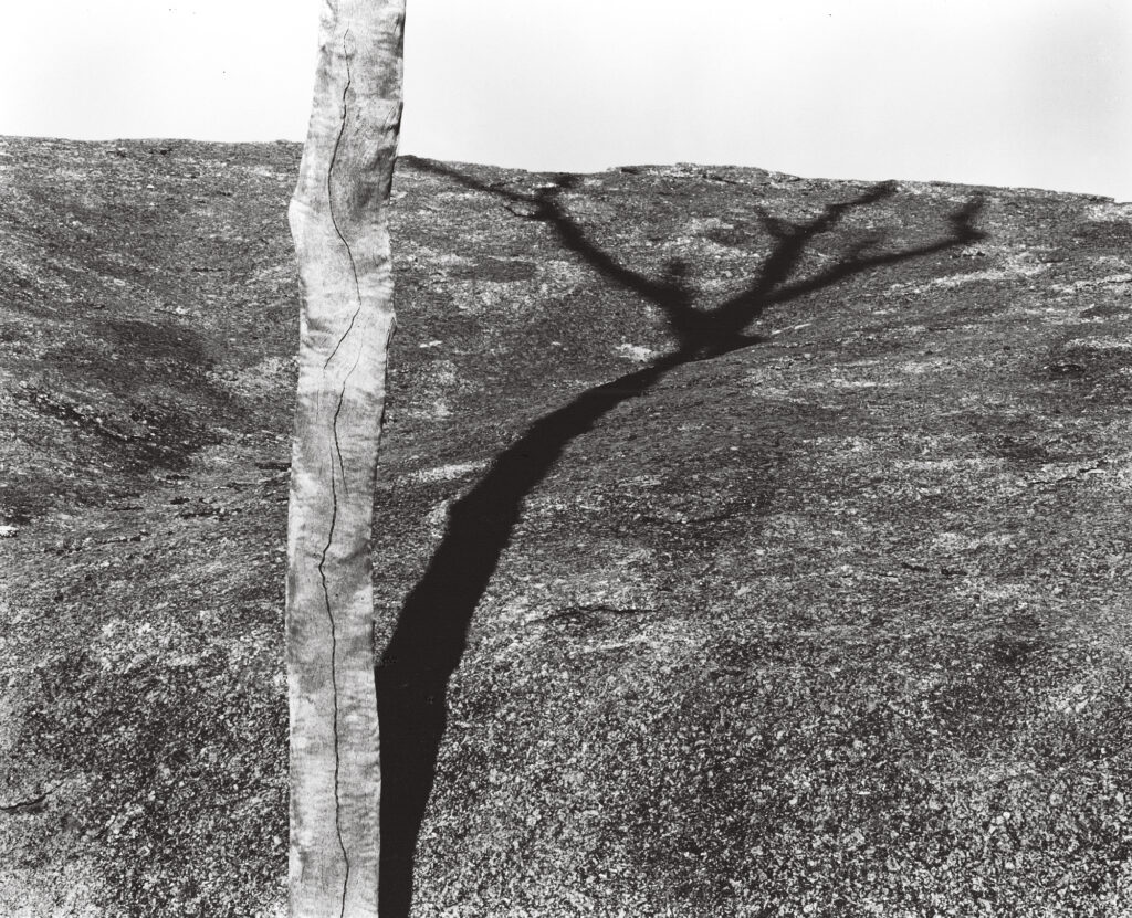
I’m not sure whether ortho film for copying is my thing and I would very much welcome any comments or suggestions on the subject. In the back of my mind I am considering the possibilities of making 8X10 B&W copy negatives and using then for contact print processes like home-made emulsions or similar. Despite the problems inherent to the process, I am fairly happy with a negative created using a transparency of suitable contrast that does not include sky, and with about 13,000 of them stashed in my darkroom I can probably find a few to fit that brief.
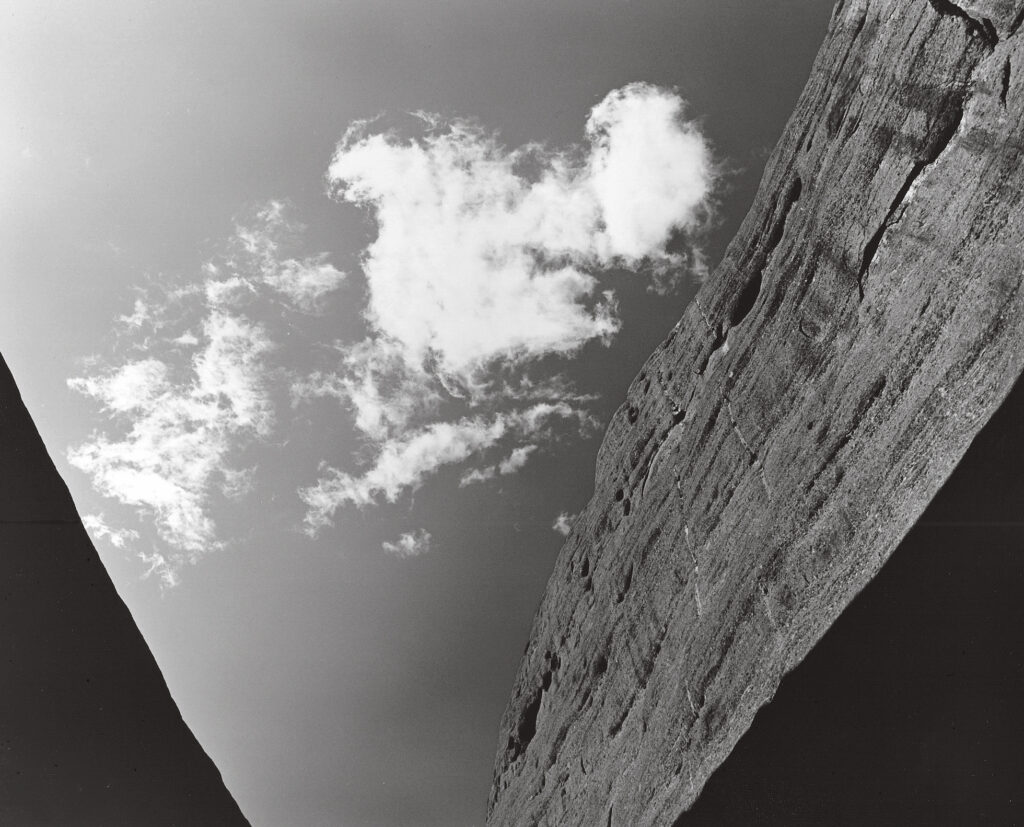
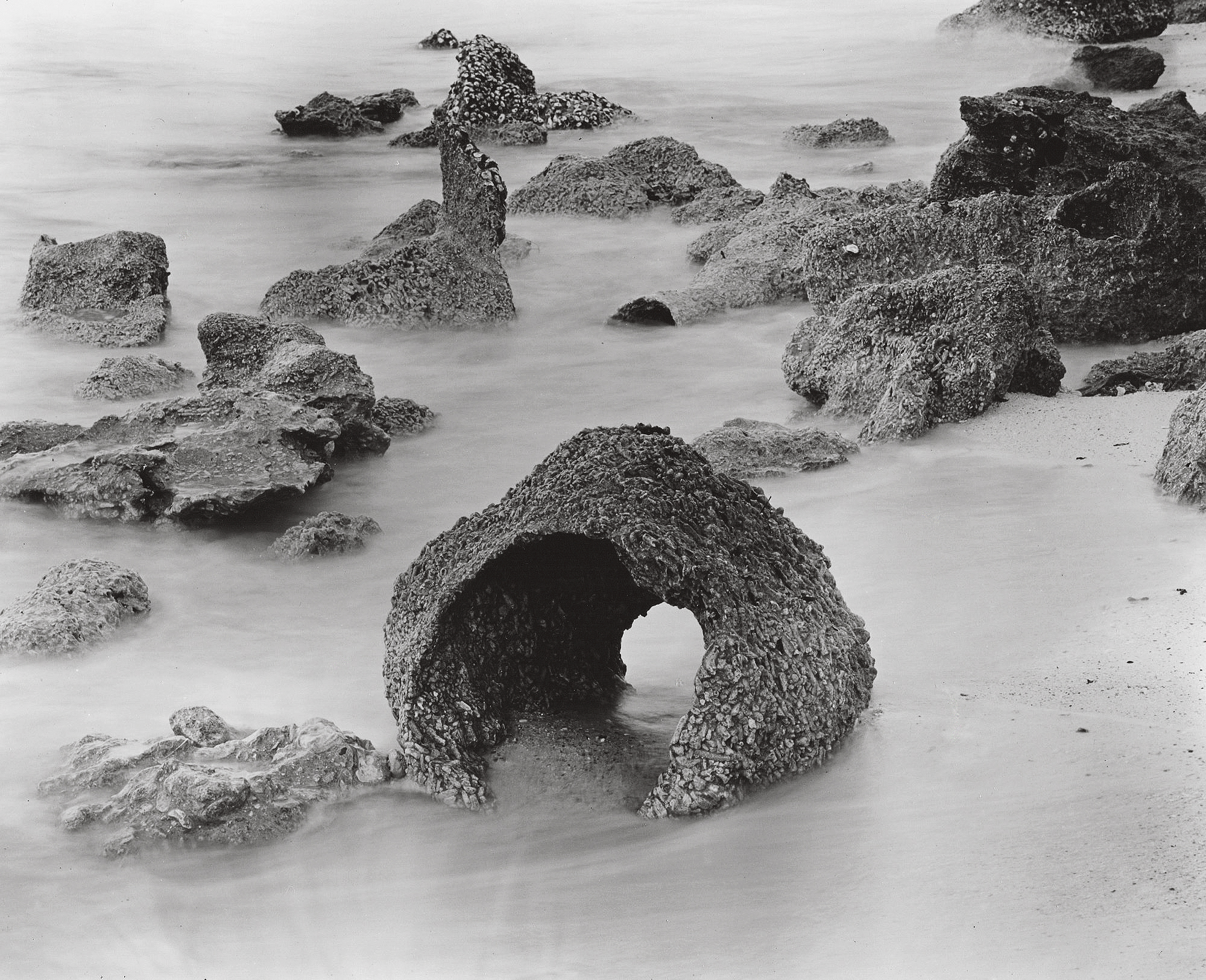
In this case the tonal transition across the sky is fairly even and basically proportional to that of the colour tranny. While I still like the original colour version of this Kata Tjuta valley with its typically outback patina, I think this B&W print offers the cloud entity a more holistic role to play in its now monochromatic setting.
Next Post: Exhibition: Primary – Leanne McPhee
Previous Post: My Ansel Adams Moment – David Rendle

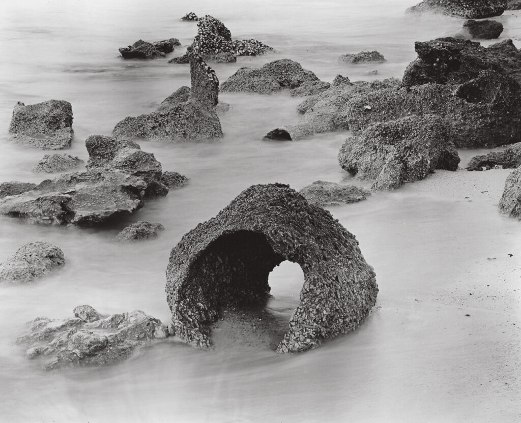
I think the images you have chosen have benefited from conversion to black and white. I particularly like the black and white renditions of “sand castles” and “shredded”.
Well thankyou Peter, it was certainly an interesting experiment to do the conversion using ortho film. I agree with you that B&W can benefit some subjects, but the take away lesson for me was to use B&W film in the first instance where possible!