The Photograph Considered number thirty five – Greg Wayn
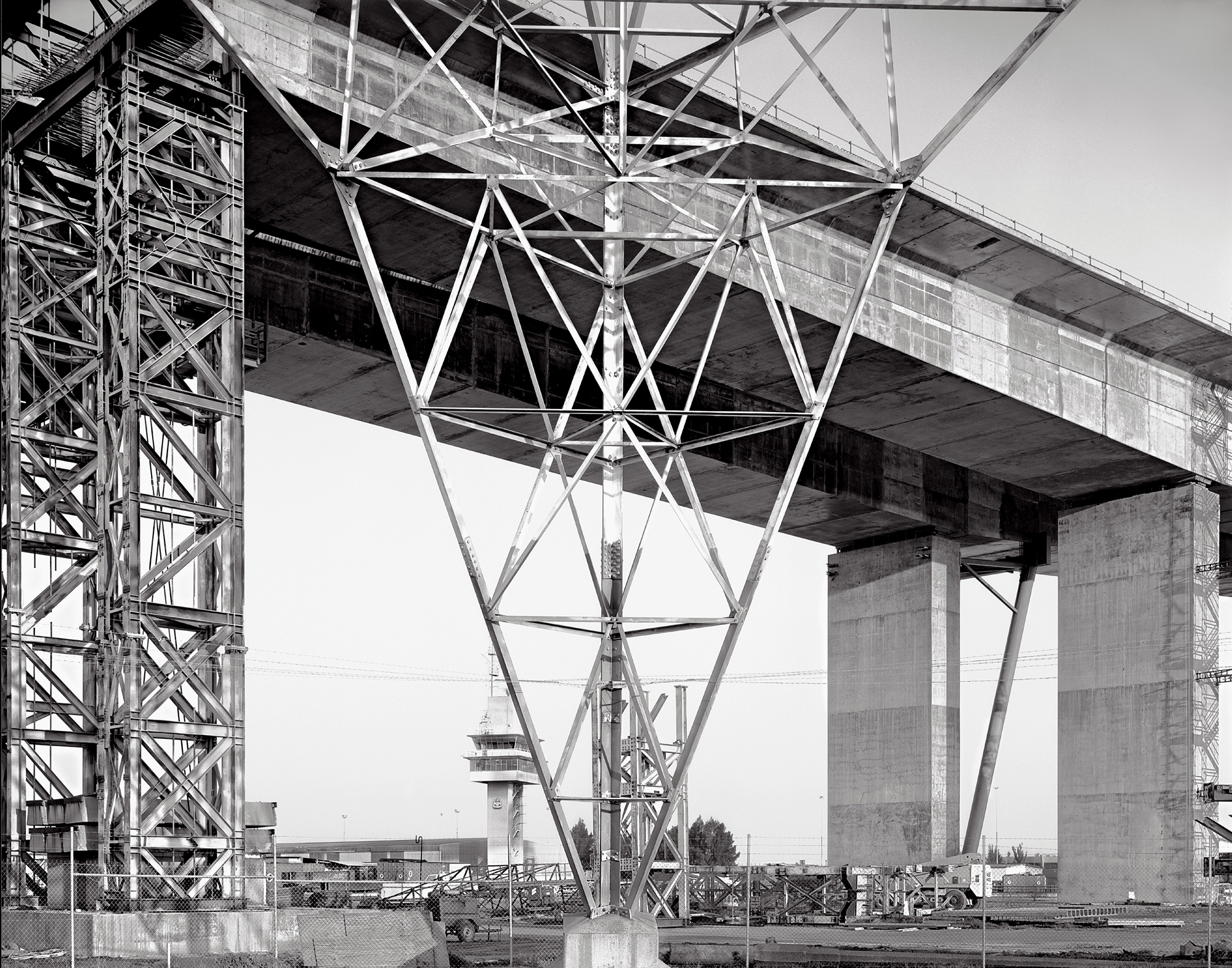
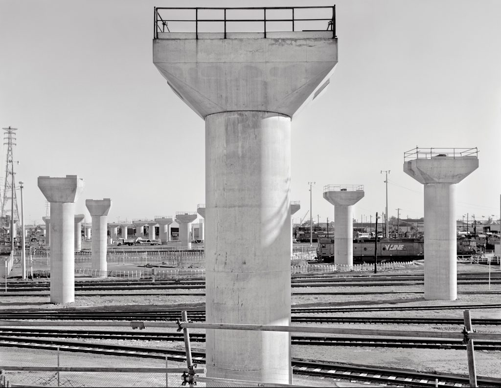
Bolte Bridge 1998.
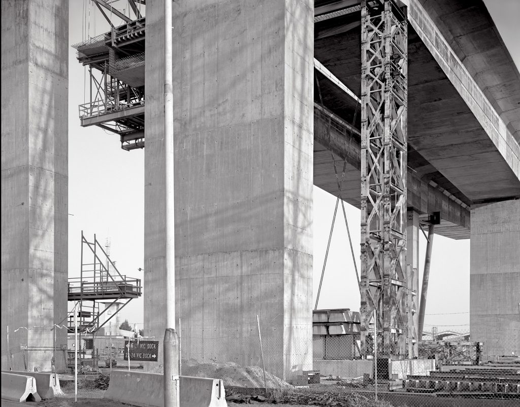
This image of the Bolte Bridge under construction was made in 1998 and eventually formed part of an exhibition called VERTIGO, at theLab X Gallery in 2004, (a joint exhibition with Greg Neville, a colleague of mine, at a time we both taught in the Visual Arts Department at NMIT).
This particular image was part of a continuing body of work looking at industrial forms and an extension of an earlier exhibition titled ‘In Industrial Light’, held at The Photographers’ Gallery in 1993 (this was my last exhibition that consisted entirely of silver gelatin prints, perhaps summarised as made in ‘the fine print’ tradition).
Although I haven’t made any significant new large format work since 1998, I had been involved with making work focusing on large scale industrial sites over many years up to that time, using predominantly 4 x 5 (and occasionally 8 x 10) format cameras. More recently I have made newer work in digital capture. For the Vertigo exhibition and subsequent ones, I have scanned my large format negatives and had the digital file printed at commercial labs in Type C (chromogenic) form or as Digital Pigment Prints on Archival Papers.
In the current industrial climate it has proved almost impossible to gain access to the sites I would want to, to continue with this work. The paranoia around OH&S issues and the fear of potential litigation from companies I have approached means I have regrettably had to abandon any further large format work. In the past I had always been able to find the means to access potential sites (by means fair or foul) and was happy to sign waivers, wear appropriate safety gear, sign in and out with security, etc., but in the current climate I have only met with management negativity to the idea of photographing in these environments. I have to say I find this not only regrettable for my own continuing work, but also for purely historic reasons I believe many of these sites have had significant impact on our developing city and if nothing else should be recorded as markers of change for future generations to ponder.
My interest in large scale industrial imagery centred largely around the dichotomy between these large and often intimidating structures or spaces and their sculpturally beautiful forms and compositions. It is important to note that while I could only get access to many of these sites during the weekend when they were not operating, even given a choice, I would not have had it any other way.
The mix of these large structures and the eerie, empty stillness produced a feeling in me not unlike that of being in a large cathedral or vast empty landscape. A contemplative arena for consideration. The rather intense, pale light was an important visual element and led to the earlier title of ‘In Industrial Light’. The quality of this light was reinforced in printing processes.
My images are highly structured and I have always taken great delight in complex spatial juxtapositions and deliberate ambiguity where forms intersect.
The use of a view camera was an essential part of these process as it allowed for very fine control over these elements. Perspective correction ability was critical and a general belief that no part of the composition should be more or less important than another, that the edges were just as important as the centre and other graphic considerations were clearly on my mind. The clarity and resolution of a large format camera was an intrinsic requirement for my industrial series and while the darkroom prints (usually 11 x 14 or 16 x 20) look suitably intense, they truly come alive at mural size proportions, revealing the full power of large format film.
I often think of a photograph in terms of a resolved two dimensional ‘drawing’ and as a visual arts teacher, I had always used principles of drawing as my focus in photography. The conversion of three dimensional spaces to a two dimensional image on a flat plane is a significant process to contemplate. The use of a ‘longer than standard’ lens in the bulk of my industrial work enhances the sense of a more compressed, intense space and again has informed my photographic practice in this aspect.
As far as the conceptual side of this work, you may deduce that it is essentially a modernist approach and I would be relatively happy with that description.
Influences
Some critical visual influences on me were, Edward Weston, Lee Friedlander, Fred Sommer, Emmet Gowin, and many, many more. My teaching in both secondary and tertiary visual arts departments meant I had a great interest and exposure to many artists, art forms and disciplines. My interest in the many politics and forms of photography and its practitioners meant I would consider my influences as wide and all encompassing.
Lectures given as part of my teaching practice in the TAFE, private Art & Photography Colleges and Higher Education sectors meant lots of research to stay current and connected to a very wide range of practitioners and styles, from traditional to cutting edge and those that challenged traditional tropes.
My first interest in large format work began with workshops with Ian Lobb and Les Walkling, both passionate and inspirational teachers. These were held at the Photographers’ Gallery in South Yarra. Further workshops with Harry Callahan, William Clift, Emmet Gowin and Tom Carabisi only further intensified my interest and desire to pursue personal work. The related exhibitions by these artists at the gallery were incredibly significant for me at this time (one has to remember the internet was non existent then).
Technical Details
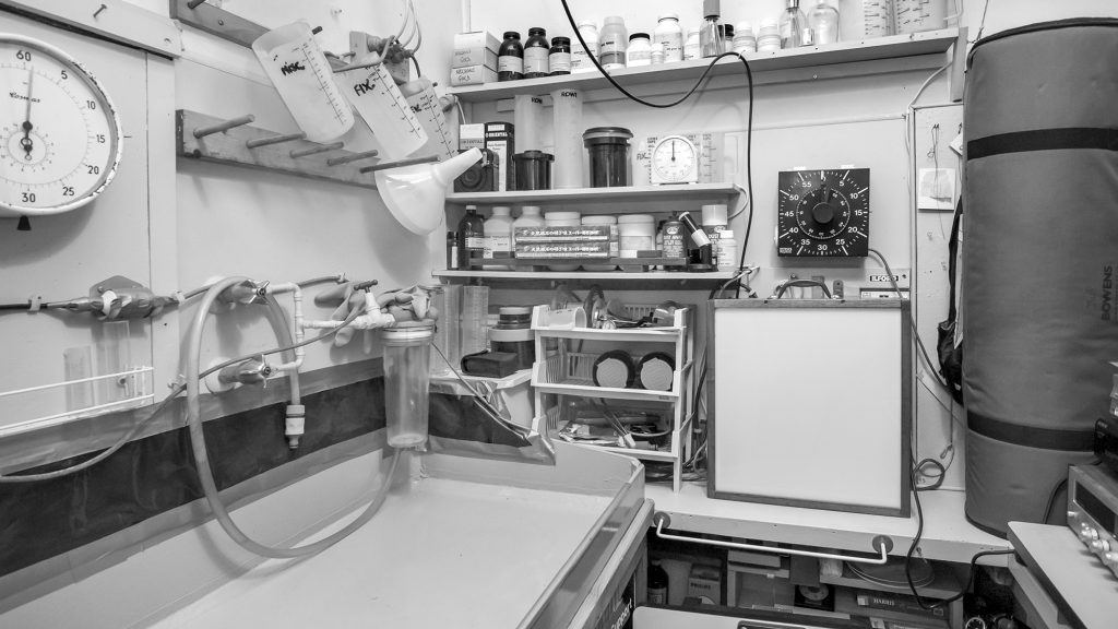
At the moment, my darkroom is still fully functional but acting more as a storeroom than a darkroom. I have great nostalgia for my time spent there. While only a small space, it was very efficient and a place of quiet solitude and comfort (as well as one of occasional anxiety). There are aspects I miss and I still see the possibility that I may return, but at my age time gets more precious and the efficiencies of digital imaging are important to me. I have to say, however, that I am impressed and thankful that there are still people working passionately with film and large format cameras, as is the making of darkroom prints and exploring alternative printing methods. It does my heart good and it still an important arena with an important role to play aesthetically and a reminder of the importance of the ‘hand made’.
Film Development
On my website in the ‘Info’ section there is a link to ‘Technical Info’, where I have put information regarding the cameras I have used. Also included is a section devoted to my darkroom processes, print production and toning processes.
I formulated most of my film developers and large format film was tray developed in a modified ABC Pyro developer. Like most Pyrogallol based developers, uneven development and oxidation issues were constant companions and this combined with limited shelf life were testing at the best of times. It took considerable time to find methods to enable evenly developed negatives. There were times where I wished I had allowed more time for photographing and spent less time trying to control these processes. I persevered with Pyrogallol, however, as I felt the outstanding shadow separations, tonal qualities and highlight separations were worth the effort. If you look at my dodging and burning notes and the amount of effort involved in making a satisfactorily tonally mapped print you might wonder about my sanity. It is interesting to note that medium format film development was not at all problematic, as completely filling the developing tank excluded all air and agitation was achieved by rolling the tank from side to side (my other favourite tank developer was Rodinal at 1:100 dilution).
In the 1990’s along came the PMK Pyro formula that solved all these issue and made for stable, even development, in both tray and tank, and as easy to use as any conventional developer.
Print Development
In the main, I formulated my own print developers from raw chemicals, with my favourites being Metol only Dr. Beers ‘A’, Glycin based (D130) or Dr. Beers 7 and occasionally Amidol. I often used a 2 bath print development system. Developer A allowed development of soft, resolved highlights and mid tones while developer B improved intensification of the blacks and added contrast (typically an 80:20 development time split).
Prints were made on graded silver gelatin papers. Typically these would be Ilford Gallerie Grade 2 (silver bromide) or Agfa Record Rapid Grade 2 (chloro-bromide).
Typical print size was 11 x 14 and the largest print I could make in my small darkroom was 16 x 20.
I used two fixing baths (for archival reasons) and Ridfix (to reduce water usage and also for archival reasons).
High quality multi contrast papers only appeared in the latter part of my career and became a powerful tool for many, and I regret not pursuing them more. If I ever return to the darkroom they would be deemed an absolute necessity as the amount of control possible is outstanding.
Enlarger
I used an LPL 4×5 7451 enlarger with Schneider lenses for 35mm, 6×6 and 4×5 format negatives.
Tonal Remapping
The idea of ‘tonal remapping’ is a critical process for me in both analogue and digital image making. The balancing of structural elements, light and dark values and their relationships, visual emphasis and modifications such as as edge burning to ‘contain’ the image. These ideas all relate to the inherent ‘drawing’ qualities and were actively manipulated to realise the final print.
Post Processing
Post processing methods usually involved print bleaching for fine highlight control, selenium toning (for print intensification and archival purposes) and other toning procedures.
These could be as simple as ‘Tea Toning’ to give subtle warmth to highlights, extremely dilute Poly Toner ( for highlights) and occasionally gold or sulphur based toners.
Mural Printing
In 1994, I attended Les Walkling’s ‘Mural Printing Workshop’. It was astounding to see the scale and ambition of Les’s system and it was a very exciting time seeing the production of mural prints on silver gelatin fibre base papers processed to the same exacting archival standards expected in existing smaller scale darkrooms. Unfortunately I didn’t have the space to consider this even as a possibility, hence the use of chromogenic lab prints for the exhibition mentioned here. The technology of large scale archival printing has moved on quickly and the ability to make mural prints from large format negatives to high archival standards is now standard procedure.
Important Archival Information
For the Vertigo exhibition, mural scale prints were necessary.
Type C prints were the only viable option and the idea of using a digital file instead of projection via an enlarger was exiting technology at that time. Lab printing of digital pigment prints at mural size didn’t exist at all, but the technology was emerging. As a salutary lesson to anyone reading this, I have included the following example as a warning.
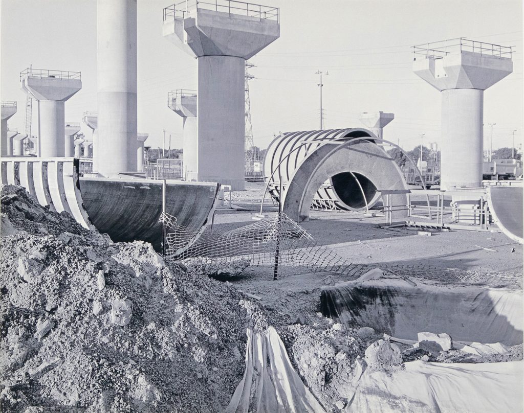
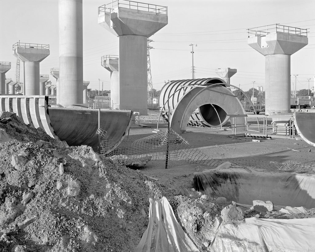
I have examples of type C prints (monochrome print from digital file), such as the one below, that had never been exposed to direct sunlight and were framed behind acrylic (hence absorbing most UV light). Despite this they became heavily faded, the yellow dyes (the least stable) completely gone and only the more stable cyan and to some extent the magenta dyes remaining in the print after only 12 years… a rather horrific outcome. I have since had these reprinted from the same digital file as digital pigment prints on archival paper (current information would suggest that these will still be viable prints in 200 years).
As an interesting aside, the image I have used for this article has been in storage and is still in relatively good condition. Major galleries who purchased work on this material are very aware of the need for careful storage and minimal display times in an attempt to preserve them as much as possible.
Scanning
I have an Epson V700 scanner that I use for my large format negatives.
In the Vertigo exhibition, there were 3 prints made from scans on my Epson, and for a very large 4 panel panorama, negatives for each panel were scanned on an Imacon Flextight 4×5 format scanner. While the Imacon was clearly superior in sharpness and evenness, I actually preferred the Epson scans (not as sharp or as much shadow detail, but not giving anything away in terms of tonality) and decided to proceed anyway and use the exhibition as way of comparing the results of the different sources as final prints in an exhibition space and was happy with my decisions in the end.
This is not to say the Epson is without problems. There are no anti-newton glass carriers available for it and the negative carriers supplied are rather flimsy. Often during a high resolution scan, the heat of the lamp would often cause the negative to expand, causing areas of uneven sharpness, particularly in the centre (the latest model uses an LED lamp and this may help with this issue as it produces little heat). The dual lens system of the scanner it least helps minimise this effect and provides enough ‘depth of field’ to minimise the problem. Lab scans were quite expensive at the time of this exhibition but have come down considerably in time. If I were to have an exhibition like this now, I would have scans done at a lab and process accordingly.
BIO
I am now retired from teaching and have been living in Alphington (Melbourne) for the last 40 years.
I taught at NMIT (Visual Arts Department), Monash University (Caulfield Campus, Photomedia),PSC (Photography Studies College), ACPAC (Australian College of Photography, Art & Communication), ICAD (Independant College of Art & Design), and Peter Lalor Secondary College (Art Department),
Main Exhibitions
2013 Chemistry Of Chance, Edmund Pearce Gallery
2006 Phantasm, Lab X Gallery, Group Exhibition
2005 Whiteout, Span Galleries, Group Exhibition
2004 Vertigo, Lab X Gallery, Joint Exhibition
1993 In Industrial Light, Photographers’ Gallery, Solo Exhibition
I have also participated in numerous yearly college staff shows and local exhibitions.
Blurb Books
My recent projects have mostly entered around producing a number of books on the Blurb platform.
The most recent ones are…
Darkroom Discards
Based on rephotographing discarded test prints from college darkroom bins
The Archive Project
A photographic investigation into my collection of unusual objects
The Amcor Factory Project
A photographic exploration of the gradual destruction of the local Amcor Factory site
Greg Wayn Photographs
A monograph of my large and medium format work
These books can be viewed on the Blurb site … au.blurb.com … then entering my name in the search icon
Or conversely there are direct links to each book on my blog under the ‘Books’ page link.

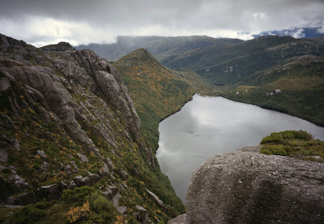
More of Greg’s work can been seen on his website and here.


Greg great article and photographs. I saw your ‘In Industrial Light’ exhibition at The Photographers’ Gallery in 1993. Strong and beautiful work. Thank you for writing this article for View Camera Australia.
Just fabulous, Greg! Took me a while to digest the material.
Can’t imagine how many man-hours had gone into the preparation of the article you did for ‘View Camera Australia’ . Truly unique in every way. Thanks for sharing.
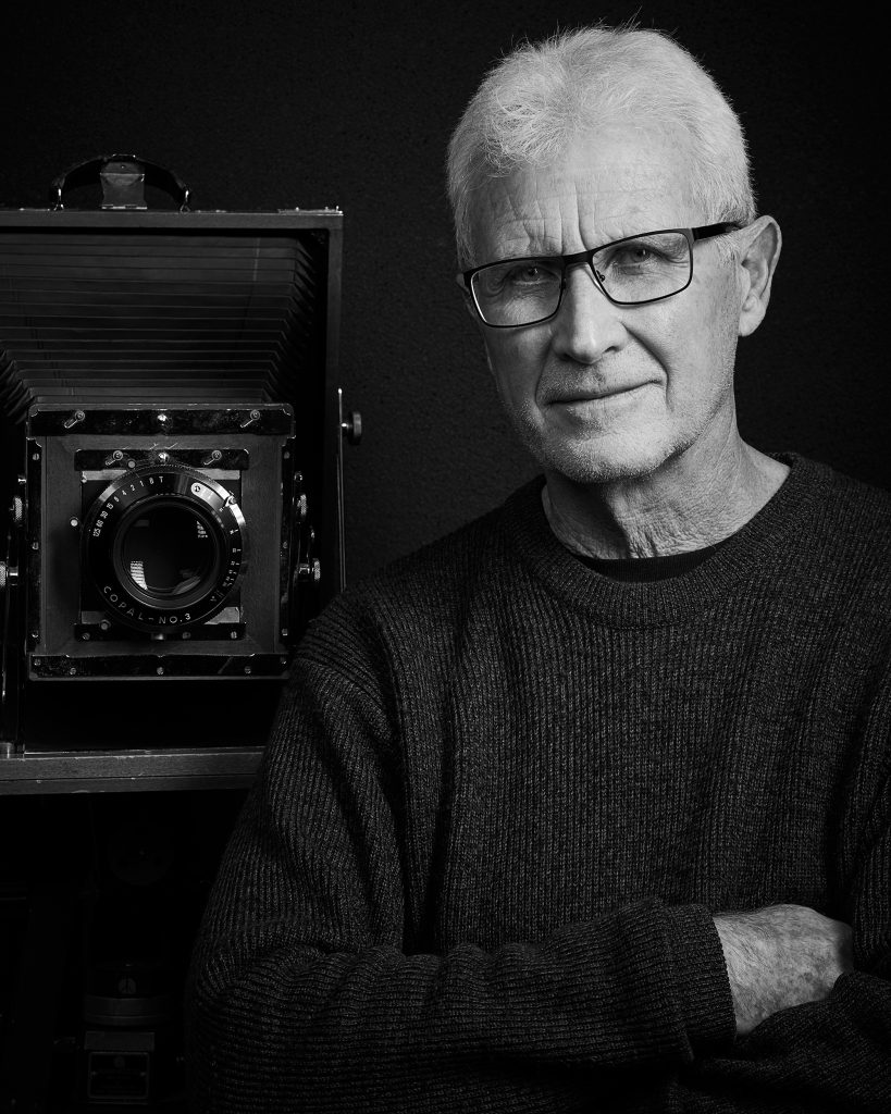
Compliments too, on your flattering portrait that Josh took!!
Greg, thanks for sharing your images, along with an interesting article which explained your thoughts and workflow behind the making of your photographs. It highlighted the importance of the photographer giving careful consideration to printmaking. Nowadays there is a plethora of printing technologies, print substrates, and workflows to choose from. Convenience can be a powerful motivator, but at what cost to the photographer’s original vision and intent? Especially if the photographer is not directly involved in the creative decisions within those technologies and workflows. Every workflow has its compromises. The manner in which we choose to make our prints and display them says a lot about our own attitudes towards our work. Your article is a timely reminder and provides much food for thought.
Congratulations Greg, a great article that allowed me to more fully understand and experience your thinking and practice.
The article is rich with concepts, historical frameworks, and your incredible inside technical and material knowledge!
Your images are sensational – monumental, enduring and simultaneously bleak and seductive.
Thank you so much.
Great article Greg that not only covers your journey as a successful photographic artist but traces some important history of Fine Art Photography in Melbourne over the last 50 years. In the 70’s And 80’s access to interesting industrial sites was easy we enjoyed some great times in Williamstown photographing the old railway yard and the Williamstown Pumphouse often accompanied by Bernie O’Regan.
We can now look back at the Photographers Gallery workshops run by Ian Lobb, Les Walkling and eminent American photographers as not just fond and inspirational memories but profound historical markers of analogue photography in its heyday. These influences and your dedication to teaching have clearly contributed greatly to your mastering of both analogue and digital photography.
It has been great to see your work develop from the straight monochrome industrial photographs of the 70’s and 80’s into more abstract digital colour work in recent blurb books and your website. Also great to finally see your work on this site for all to enjoy and will no doubt inspire younger photographers.
Your impressive portrait standing next to the 8×10 suggests there is still a strong connection to “old world” photography and perhaps a new chapter to explore?
These are such vibrant and elegant industrial photos Greg. They also have a strong historical overlay of both Melbourne’s development and late modernist, analogue photography in Melbourne. In many ways this body of work is a time capsule of the 1980s and 1990s.