Green into Grey – Murray White
Many people could assume, quite reasonably, that rainforest and black & white capture would be a perfect match. Misty atmosphere, tormented lighting and a tactile jungle of line all seem to cry out for monochromatic treatment as a way of taming the rawness of their visual being. Indeed to a photographer, the very destinations that typify rainforest often appear monochromatic from the outset, before a darkslide is even removed.
Dense foliage is all-encompassing, from the squelching moss underneath our feet to the multi strata canopies looming above. Linking structures tend to be shadowy clones of each other, reducing the colour palette to one primary and overwhelming colour, green. Surely to a view camera devotee this is mono nirvana?
Well in my experience, not necessarily, and with the expressive results attributed to many colour renditions, perhaps reaching for B&W film may be a backward step. Images interpreted by colour can bring to life the often subtle changes in hue that go to make up the overall rainforest environment. Over the last four years, and with some disappointment, I have learned that a similar translation is not always the case in B&W.
Under subdued lighting, the existence of little, if any reflectivity variances, can render a monochromatic capture as a murky version of what is actually a vibrant forest. In addition, the supporting patches of stronger colour, fungi, dead leaves and so on, become merged into the midtones, and effectively into visual oblivion. More direct lighting risks the creation of highly contrasted images, bringing both visual complexity and the inevitable loss of some detail.
I believe that the full capabilities of monochrome fall short of their potential, if I approach a rainforest as if it were just another landscape. However, I have also discovered that by shooting selectively and applying a few basic principles, it is possible to reclaim some photographic advantages, together with a few rewarding prints. By anticipating the colour conversion limitations, images can be found that literally shine as a B&W interpretation. Here is what I look for to turn green into grey.
Cloudy is fine.
I avoid blue sky days when venturing into the rainforest. The difference between highlight and shadow is extraordinarily broad, and there will almost certainly be details that are needed in both areas. Bright skies are also responsible for complex and potentially distracting shadows in the image, courtesy of an irregular tree canopy and a leaking matrix of light entry points.
On the other hand, cloudy days are are ideal for rendering detailed subjects in the forest, with diffused light filtering through the scene. Negatives erring on the flat side are always possible under extremely soft light, but increasing the contrast when printing is usually not a problem. I have experienced much more difficulty trying to recover detail lost to the shadows or highlights at the time of an excessively contrasted exposure. More serious B&W enthusiasts than I might tray process individual negatives with modified development techniques, but I don’t go there!
If sunny days cannot be avoided, I try shooting early or late in the day, or shoot into the light, but expose for the shadows; I find this helps to capture the subject detail, while isolating it in front of a lighter background. Sometimes this strategy helps me simplify an otherwise complex image by allowing some detail to be swallowed up in the highlights.
Tripods rule.
As a view camera proponent, I use a tripod all of the time anyway, but find that many of its same benefits apply when I use my rollfilm Mamiya as well. Framing decisions can be made precisely, the horizon (or dominant verticals) can be placed exactly, and the most appropriate aperture can be chosen.
Of course subject movement with slow shutter speeds on windy days must still be considered. However I find that the localised blur of subject movement is often preferable to using a faster shutter speed and larger aperture. Sometimes the selective blur of moving foliage injects a sense of life into otherwise static scenes, while a shallower depth of field is often inappropriate for a large format landscape capture.
By way of contrast.
Contrasting colours have an immediate impact on the eye, but variance of tone sometimes escapes scrutiny; it is often more subtle. As a B&W shooter, I try to identify and use these areas of a composition to maximum advantage. While low contrast lighting is helpful to capture the details in a monochromatic image, it is the high contrast elements that define the picture. They are the basic building blocks by which an image is constructed and understood.
Too little contrast may result in an image without substance, or at least, without presence, although visual merit can still be a feature. On the other hand, too many areas of contrast creates a busy photograph where the main subject is in danger of being swamped by visual noise. Finding the balance requires the ability to see where the contrast lies, and how best to use it for a given subject.
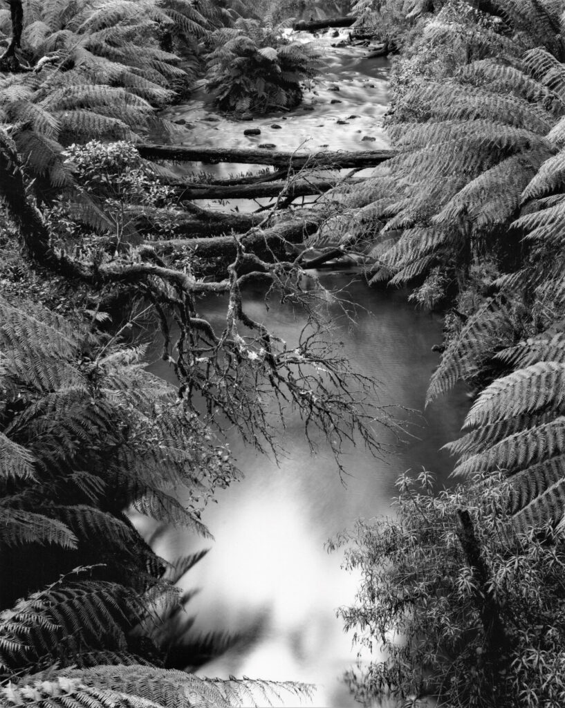
I sometimes squint my eyes toward a scene, to visualise how well areas of darker tone stand out against those areas of lighter tone. The trick is to find the most suitable viewpoint that will allow overlap of these areas to precisely define the features that are seen as important. So for example, in a rainforest setting there may be dark toned vines hanging in front of a light toned tree trunk. This juxtaposition will amplify the shape of the vine, and perhaps the comparative bulk and form of the trunk. Multiple overlapping areas of contrast introduce the illusion of depth, which I find to be a very desirable quality in a typical landscape.
A narrow view.
It is sometimes suggested that photographers should compose an image to their satisfaction, then without pressing the shutter, get twice as close to their chosen subject. This advice may be a little clunky in practice, but its principle is valid. We tend to place equal value on everything in front of us, but in reality the scene we see is made up of smaller pictorial elements, each bringing their own qualities to the overall package; these are often qualities that deserve assessment in their own right.
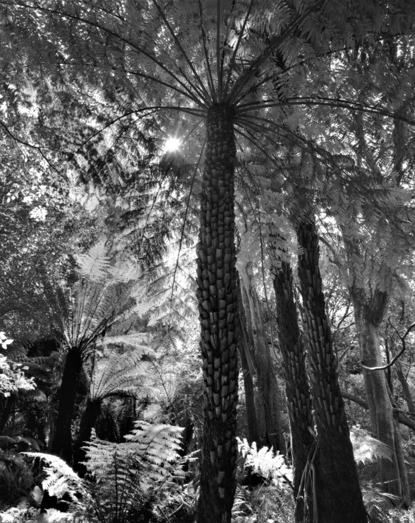
In the rainforest we may walk beneath a stand of tree ferns that impresses us because of its multiplicity and size. Contained within a print, that same stand no longer maintains its physical presence, and therefore its significance to us as originally felt. It may still look impressive, but that will be despite its size; it could be impressive as a photograph for another reason entirely. Or, it might look busy and puzzling to a viewer unfamiliar with the subject.
Assessing the visual value of our subject is something that I believe is an important part of the compositional process. These tree ferns may have impressed at the time of capture because of their scale, but what we really see is lots of lovely detailed fronds and the trunks supporting them. Will multiple examples of these fronds add to the viewer’s appreciation of the subject? Perhaps one tree fern would be enough to achieve that. Perhaps just one frond.
Rain is your friend.
It will come as no surprise that when we visit a rainforest on a cloudy day, we may experience..rain! I try to adopt a philosophical view at these times by remembering that without rain we would not have the forest. So given the likelihood of rain, I always carry my gear in a waterproof bag or pack, or have a suitable cover at the ready. I normally use a shoulder bag so that I don’t have to put a backpack on muddy ground, but some people carry a small plastic sheet for this purpose.
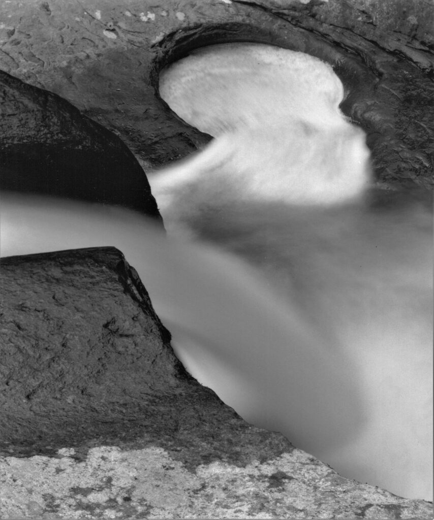
I also like to keep shooting after the rain; it is a lovely time for photography with glistening tree trunks and water droplets clinging to the vegetation. Waterways are especially photogenic following rain, not necessarily because of an increased water flow, but because any rocks in the area glow with reflected light. I am always wary of slippery obstacles when walking in the rainforest, and regularly check for water drops on my lens before and after taking an image; the trees keeps dripping well after the rain has stopped, and water on a lens does nothing good for image quality.
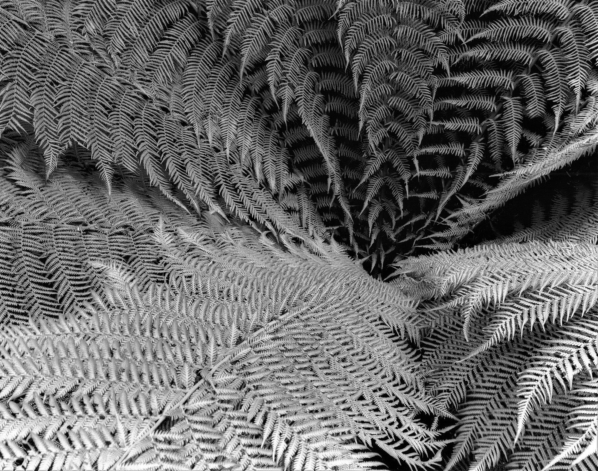
Main photograph above:
SPIRAL ATTRACTION
I try to avoid too much complexity with studies of shape or form, and where possible, find subject examples without damaged sections, or visually competing material. In this case I cropped out the competing interest, and plucked a number of wind blown leaves from the main subject. This allows the viewer access without distraction, to a homogeneous subject, where the interplay of fronds is the primary interest.
